Hobonichi Techo Planner A6

So sorry this has taken so long. I’ve been dealing with a lot of administrative stuff and been a little stressed out since I came back. The reviews for July and August will be a bit late as I have nothing new to review as of now. I will try to get some stuff in later this month and will hopefully get back on track come October. Thank you so much for your patience. It really means a lot to me for you to stick around even with the irregular schedule. See you soon!

DSCF1727

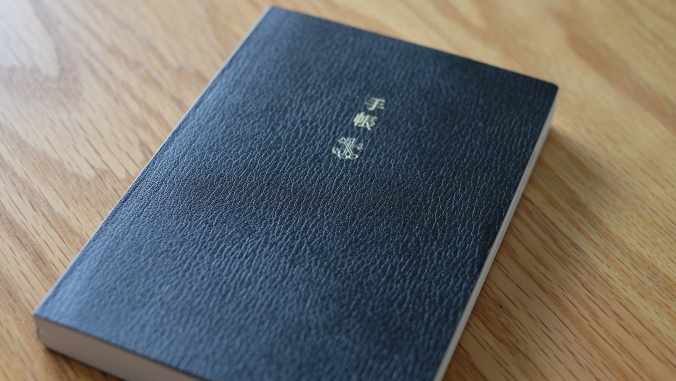
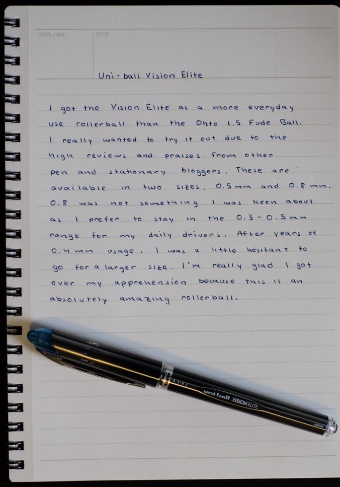
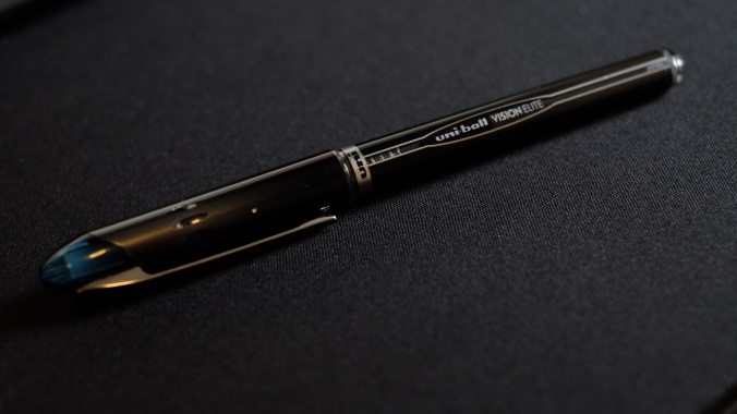
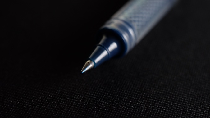
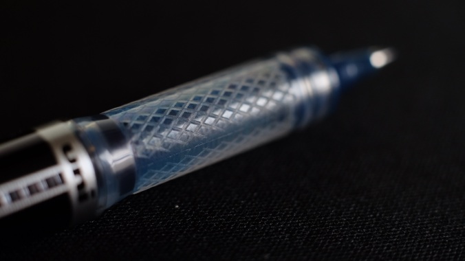
Now this is a product that I had been waiting to get for a long time. I initially discovered the Hobonichi Techo during the time it first got extremely popular and there were several stationary bloggers that were extolling its numerous virtues. I’ll admit that I wasn’t very keen about it in the beginning. After years of scheduling and managing my weekly agenda with the excellent Calendars 5 app from Readdle. I never once gave a thought about buying and maintaining a physical planner. That all changed last semester when I found that I wanted to stop depending on my phone to manage my life and I discovered the limitations of the notes and what I can jot down. Alongside this discovery, I realized that it would be a seamless transition because everyday, I focus on writing my notes down in a notebook instead of using a laptop. Just transferring my schedule over to a planner would not be that difficult because of how much I write already.

DSCF1726

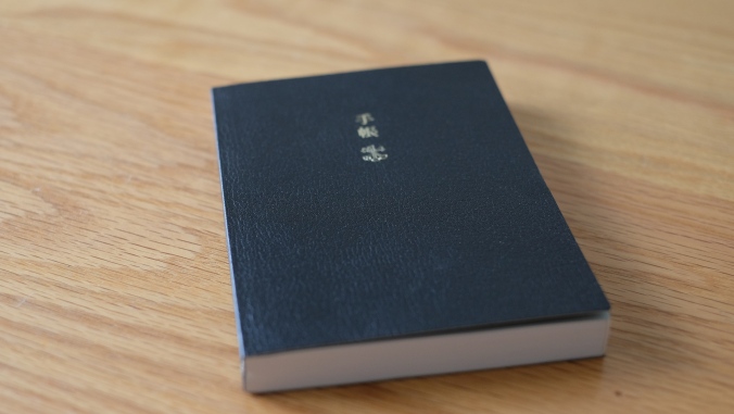
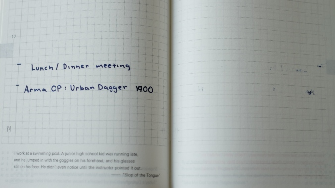
So I pulled the trigger and purchased the Hobonichi Techo from JetPens and with bated breath and excitement, I waited for it to arrive. Shipping was fast as always, and within 3 days, all the pens and the Hobonichi were in my hands. Keep in mind, that I had ordered the Techo in the middle of January, so I was a little hesitant to start using it right away and stored it away until the beginning of February. I remember clearly even to this day, on January 30, I excitedly opened up the Techo and started my first page on the 1st of February. Carefully having planned out my day in advance, I decided to keep the markings minimal to leave as much space as possible for any notes I wanted to write. Surprisingly, I found that for regular entries regarding classes and schedules, it wasn’t all that helpful, as most of the due dates for assignments were easily accessible through my school’s assignment portal, Canvas. Without those, I came to realize that it wasn’t the daily occurrences that needed notes, it was all the meetings with groups and friends that I needed to keep track of. Oftentimes, the specific room numbers and locations weren’t able to sync with Google Maps on the Calendars 5 app, which caused me to turn to the Notes section to keep track of room numbers and anything I needed to bring. Now that I had the Hobonichi, it was extremely convenient to write down the specifics of the meeting. I also found that in my case, I remembered a lot of the information off the top of my head, which is a benefit that comes with writing stuff down.

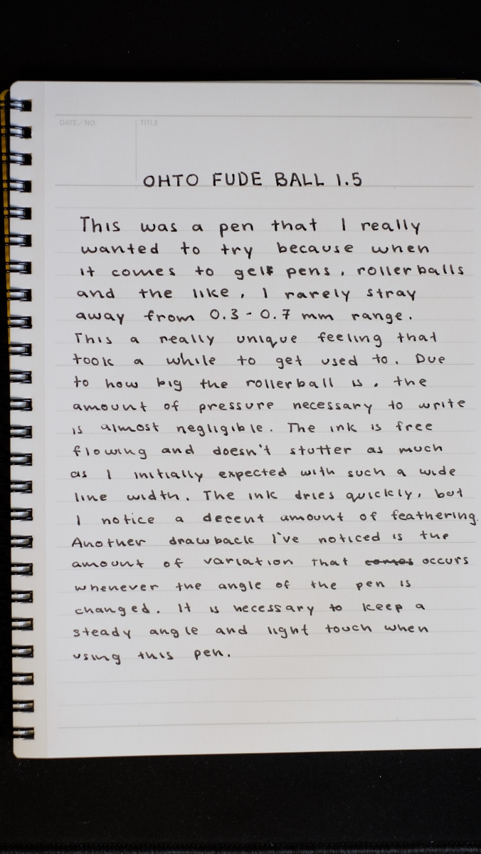
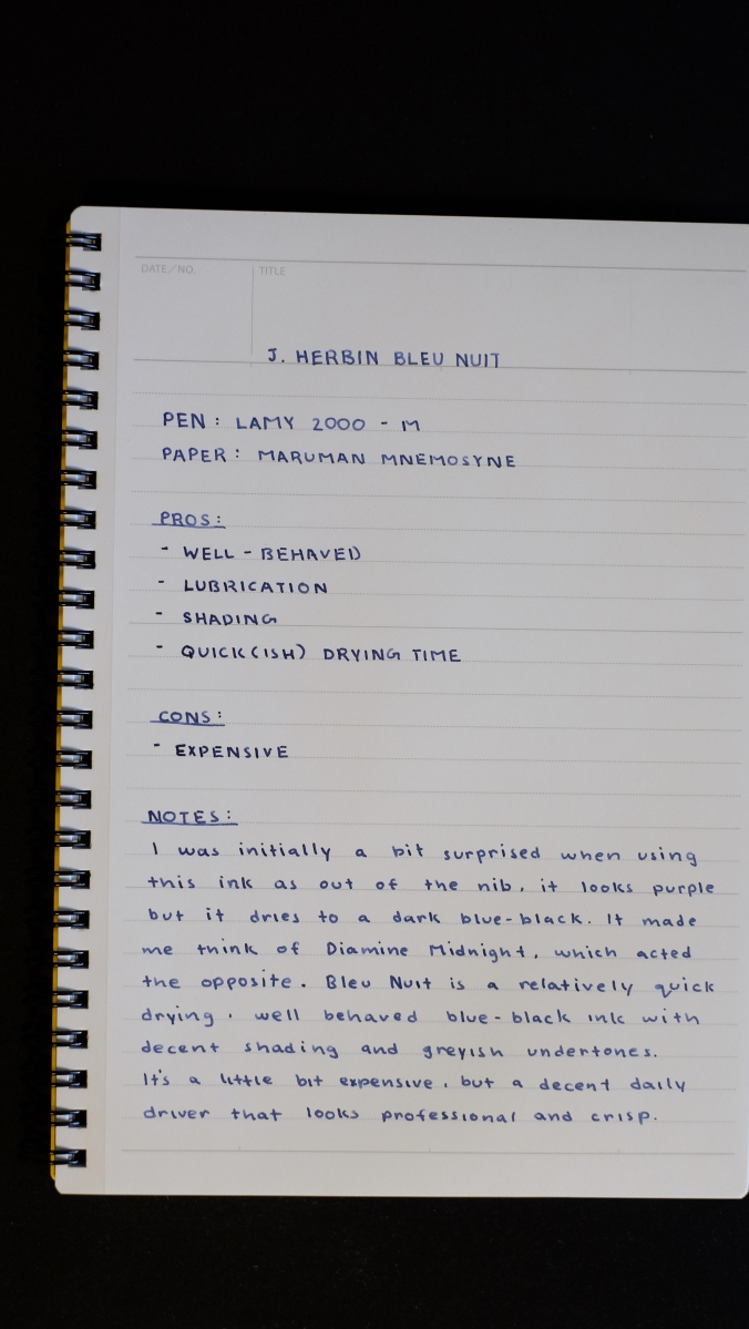
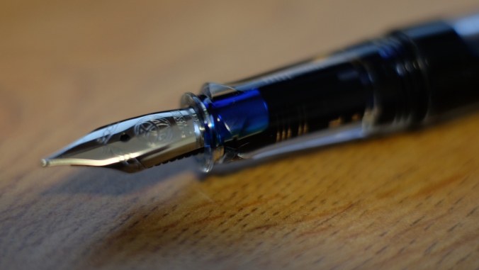
While the Hobonichi clearly became an integral part of my daily writing and just about replaced my smart phone app. There were some things that I had a couple of frustrations with. Since 2016, the amount of hype regarding Tomoe River paper was something that I absolutely could not ignore. With many stationary review blogs extolling its many virtues, I knew I had to get my hands on some. However, the biggest thing that stopped me was the price. Tomoe River notebooks were prohibitively expensive. I remember that there were some sellers selling sample packs of 5-10 pages to try out before investing in the journal. The problem was, no matter when I went on, they were always out of stock. Ultimately, I decided to give up on getting it and chose instead to wait until it became widely available through some of my favorite stores. I never thought that my first experience would come from the Hobonichi and I can definitively say that this paper caused me a lot of headache. To this day, I truly can’t decide whether I love it or not. The paper is silky to the touch and when using any king of pen, it’s smooth. At the same time, due to its thinness, ghosting can be a real issue. I noticed this most prominently when using a Pilot M nib. There were several instances where I just could not focus on writing down my notes because the words on the other side of the page were distracting me.

DSCF1732

Another downside to the Tomoe River paper was that it took a much longer time for the ink to dry. Many times when I thought the ink had dried sufficiently, I closed the planner only to find ink smeared on the following page the next morning. This really annoyed me as I have a thing for keeping pages clean and neat. Overall, there were so many great things I experienced, but it took me a long time to get used to the TR paper’s inherent “flaws”(these are subjective, so while they may be flaws to me, others might not mind as much).

DSCF1731

I have to say that the Hobonichi definitely changed my mind regarding physical planners and I feel that they are a great alternative to a smart phone app. An app does offer convenience and will outperform a planner in terms of efficiency of planning and visualization in some cases. With the ubiquity of smartphones and how attached users are to them, it is a bit of a trip to write in a planner, but it’s something that taught me a lot about prioritization of tasks and gave me some very important insights into how I manage my time and what I could be doing to better my productivity. There are a lot of things I want to get done nowadays, I always used to complain that “I just don’t have the time”. After close analysis, it’s come to my attention that is simply not true and that I need to focus on planning out tasks and completing them. I’m honestly not sure if I’ll end up getting another Hobonichi as I’ve been dying to try out some other alternatives like the Midori planner and the Roterfaden Taschenbegleiter, both systems that have been promoted and loved by some of the people I really look up to in the stationary world. While I don’t know about the future, I sure know that I’m currently loving the Hobonichi Techo and I highly recommend it to anyone wanting to start keeping a physical planner.

Bic Gel-ocity

Review 3/3

Now this was a pen that I didn’t expect to be reviewing, but kinda just happened to fall into my hand when a friend left it at my place. When I tried to return it, he brushed it off and told me had 3 more and that I could keep this one. Given that I had just acquired a new pen that I had never tried before, I figured that I could write a review of an apparently very popular choice for a cheap ballpoint. I didn’t realize how popular this was until I looked around in my stats class and counted 5 people around me using this pen. Either these were given out for free, or it was indeed a tried and true choice for them.

DSCF1714

The Bic Gel-ocity is a rather interesting pen. It is a standard 0.7mm black ballpoint and there seems to be no special characteristic about it. In fact, it’s only sold in packs at office supply and other stores. I simply could not find a retailer that was selling these individually. It’s $5 for a pack of 4 and that’s the only way which I found it, in a pack. There were no sites that were selling it on its own and I think that’s mainly how BIC products are sold. The main focus is not quality, but value. This means that instead of selling one amazing pen, they sell packs of average pens. With this in mind, I really wasn’t expecting much out of the Gel-ocity, however I was surprised by how my first time writing with it was.

DSCF1715

It was a surprisingly smooth and above average performance for a standard BIC pen. The grip is much better than I thought it would be. Based on looks alone, the grip doesn’t seem like much, but the scored lines do a great job of giving the writer a decent amount of purchase. Simultaneously, it is made out of an extremely rigid material with minimal “give” if any. I found my fingers becoming slightly cramped after an hour of continuous writing. At the same time, the overall writing experience and the smoothness of the ink was exceptional and wasn’t affected despite my changing writing style due to my discomfort.

DSCF1717

I would definitely give this pen a look if you are interested in spending about $3 for a pack of pens instead of the usual one good pen. While this doesn’t match my tastes, I’m sure there are advantages to getting a 5 pack and not having to worry about replacing them or losing them. I think these would be ideal for an office or classroom setting where you can use it and abuse it without having to worry about any of the things that would come with using a nice pen, such as a fountain pen.

Uniball Jetstream – 0.7mm

Review 2/3

DSCF1700

I purchased the Jetstream due to a recommendation from one of my friends back in Cali that swore by it. He said, and I quote, “It is by far the best pen I have ever used and if I could chose one pen to use for the rest of my life, the Jetstream is my choice”. Very high praise, coming from someone who I helped get into pens and stationary. He’s extremely picky with his writing experience and had gone through several pens throughout the years, but this is the one that immediately grabbed his attention and the one that he still writes with today. With such a sterling recommendation, I knew I had to eventually try it out, despite my then slight dislike of ballpoints. The years went by, he and I fell out of touch for a long time and I just recently reconnected with him. One of the first things I remembered was his love of the Jetstream and asked whether he’s still using it, to which he replied that he is and still loves it. Time makes us all  bit wiser, and after finding some great rollerball style pens, I was coming around on considering using ballpoints. It was the perfect time to experience what my friend did and I leapt at the chance. Suffice to say, he was right about everything.

I absolutely love this pen. It was love from first write and after constant use for the last 5 months, my love for this pen has consistently grown alongside using it. Everything from the design to the writing experience is downright amazing and I have never experienced such a great desire to write more with a pen since I first used my beloved Pentel Energel.

DSCF1706

The simplistic design that is classic Uniball takes a nice detour to something that is extremely elegant with an all black finish and a slightly textured plastic body with tastefully minimal branding. The overall design is very streamlined, as would be expected from a pen called Jetstream.

DSCF1701

The clip is pretty standard and not really that durable. I did notice a bit of excess bending when I tried to use it in the same scenarios as the highly flexible clip of the Tombow Airpress and it would not bend far enough to allow for versatility in how I carried it.

That being the case, it found a nice home inside my Nock Co. Sinclair, where I keep all the my daily drivers. More often than not, after first experiencing the amazing feeling of gliding across the page with it, I found myself reaching for it more often. In fact, I’ve been using it exclusively for taking notes in the stats class I’m currently in. It feels great writing with it and as an added bonus, with me enjoying writing, I’m also paying more attention to the material, being in a good mood and all.

DSCF1703

The Jetstream’s grip is really nice, allowing for a lot of purchase while also not bulking up the pen’s slim profile. The grooves in the grip are reminiscent of a shark’s gills, which also adds to the whole jetstream vibe that the pen gives off. The grip tapers off at the sides, allowing for a good amount of cushioning near the front, where it is most necessary and there is a very distinct delineation in the curve where the writer can feel where the extra padding is. I feel that it’s a very good choice as it prioritizes the comfort of the writer while also allowing for a confident grip for long writing sessions.

Overall, the Uniball Jetstream is a very well designed, sleek and comfortable pen that offers an amazing ballpoint writing experience. The ink is smooth, consistent and great with all kinds of paper. I would highly recommend anyone who wants a great ballpoint pen to put the Jetstream at the top of their list, because it is certainly on the top of mine.

Tombow AirPress Ballpoint – 0.7mm

Hello everyone, so sorry with the late updates. I’ve been a little busy the past few weeks and decided that whatever happens, I’ll catch up on reviews this Sunday. So this is review 1 of 3 and the rest will be published shortly. Thank you for your patience so far, and it’s good to be back. 🙂DSCF1712
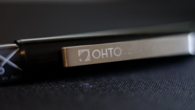
The Tombow Airpress Ballpoint is a very interesting pen that fits into the built like a tank category. Other pens in this category are the Fisher Space pen, Uniball PowerTank and other such pens that are meant to take a beating and still be reliable writers when necessary. I’m usually not one to carry these types of pens mainly because I don’t carry pens in my pocket. All my writing utensils are always in my backpack encased within my Nock Co. Sinclair. It’s one of the reasons why I’ve never bothered really picking out a solid “EDC” pen (because I’m always walking around with my backpack). I was a little hesitant to really get the Tombow due to the slightly extravagant price of $8.50 on JetPens. I’m happy to report, however, that I was wrong to hesitate and have discovered a new-found appreciation for pocket pens that are built for EDC.

DSCF1710
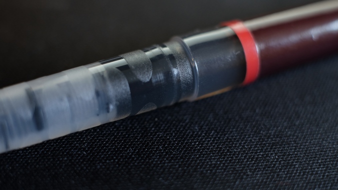
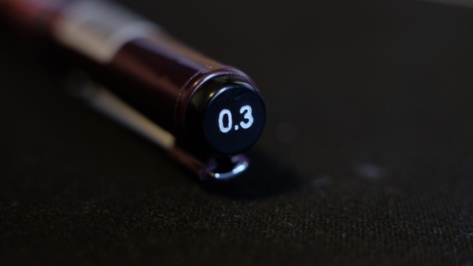
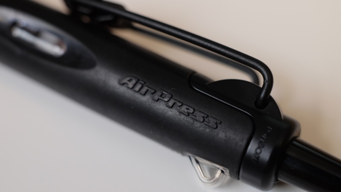
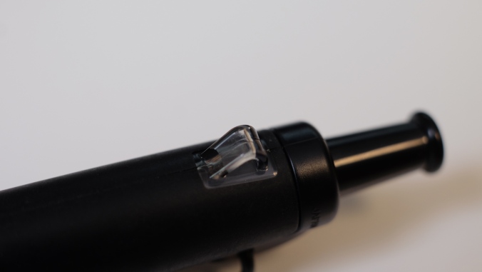
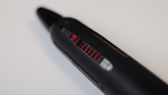
My initial reaction when I first pulled the AirPress out of the JetPens package, was astonishment at how nice it looked. If you’ve been following my blog, you all know that I’m a sucker for blacked out pens. It’s aesthetically very pleasing and is my preferred style choice when I need to make a decision. The Tombow AirPress, in my opinion, is a perfect example of minimalist, utilitarian design. The branding is subtle and matches the color scheme perfectly so as to not draw too much attention. The window that lets the writer view into the mechanism contains just the amount of contrasting color to give a clear indication when the pen is ready to write. I love the color choice as the red juxtaposed next to the all black exterior looks elegant, thereby elevating the overall look and feel of the pen.

DSCF1707

The pen is surprisingly small and light-weight, which makes sense given that it is geared mainly towards EDC and the like. It has a very decent clip with strong retention and due to its wide range of flexibility, I’ve clipped it onto anything from my pocket to a notebook cover to my mouse pad when I was taking breaks in between completing assignments. The pen also features a handy little loop on the backside of the pen for threading some string through to facilitate lanyard retention or something similar. The grips were something that I found to be surprisingly well designed. The AirPress utilizes a clear, window style grip that gives the writer a view of the spring inside the pen and provides a decent amount of purchase too. The grip is made up of clear, ovular and tapered pieces of plastic(?), that are wonderful to admire the red spring inside. I never once felt myself losing my grip on the AirPress despite the less than ideal conditions I was using it in.

DSCF1711
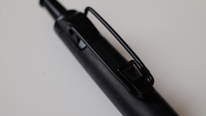
There are genuinely a lot of good things to say about the Tombow AirPress, but one of the major flaws is the writing experience. To say is was mediocre would be considered high praise. I really could not get used to how dry and scratch it felt when writing despite using a variety of papers known for their smoothness such as Maruman and Rhodia. The ink is okay, nothing to really write home about. The performance on wet paper or in the rain (yes I actually tried this with all the thunderstorms going on) isn’t as good as I expected it to be. I was expecting a pen that can match the likes of Rite in the Rain notebooks, no matter how much water falls down, it’ll keep going faithfully. This was not the case with the AirPress and I was frankly a little disappointed. While some may not find as much fault with it, with me having been spoiled with amazing pens that offer a significantly better writing experience, my bar is naturally set pretty high.

Overall, I was initially impressed with the design aesthetics and the exterior features that made this pen so versatile and great for EDC. However, when it comes to writing the same can’t be said. I’m sure that someone looking for a decent EDC pen that is built to withstand less than ideal conditions would appreciate this pen more than me, but I would also point them towards slightly more expensive options that offer more value than the Tombow AirPress. If you are interested in EDC pens and the like, this can definitely be a solid option if you don’t care much for how well it writes. If you’re like me and you’re used to pens performing like the Uniball Signo DX and Pentel Energel, this would seem like a huge downgrade and not something I would recommend.


Uni-ball Vision Elite Rollerball 0.5

IMG-0217

Alongside the Ohto Fude Ball 1.5, I really wanted to try out another rollerball style pen, as I usually don’t write with one as much as I used to. Ever since my Morning Glory Mach 3 ran out of ink, I’ve been hesitant to get another rollerball. While I can appreciate the feeling of the ball gliding across the page, it just didn’t give me a sense of feedback at all.

IMG-0207

I have slowly noticed an actual change in my tastes for what I look for in a writing experience and it is something that struck me as surprising. For the longest time, I was all about the smoothness of the nib and as minimal feedback as possible, but now, I find myself desiring a little feedback and finding some sort of appreciation for what it brings to my writing experience. Maybe I can chalk this up to my character maturing and being able to appreciate different things instead of restricting myself. Only time will tel I guess. Anyway, back to the review

IMG-0215

Needless to say when I first wrote with the Vision Elite, my conceptions on how a rollerball is “supposed” to feel were thrown out the window. Due to using the Uni-ball Signo for the longest time, I’ve gotten used to the slightly scratchy but pleasant sensation of writing with it. It gave me a perceived sense of precision and consistency that the Morning Glory simply couldn’t because of the way it would sometimes deposit extra ink onto the page causing variations in line width. The Vision Elite seems to be a strong middle ground in between the two. Smooth enough at varying angles due to the rollerball and having just the right amount of feedback that almost made me mistake it for a gel pen.

IMG-0209

The grip section is very well designed and the diamond-shaped groove pattern provides a decent amount of purchase while not cutting into you fingers. Initially, I had problems adjusting to how thin the section was in relation to the rest of the pen and my extra string grip led me to feel uncomfortable and my hand started cramping. It took a couple of days to really find the right grip strength and placement that allowed me to comfortably use the Vision Elite. Once I found that specific combination, my writing experience improved by leaps and bounds.

IMG-0212

While I haven’t been able to test it, the pen is supposed to be airplane safe with a “protective reservoir inside the barrel that prevents air from expanding in the ink tube” (excerpt from JetPens description). Since I’m taking a couple of summer courses, I won’t be able to test this out until late July, but when I do, I’ll definitely come back and update the review with my thoughts.

I’m very happy with my decision to get the Uni-ball Vision Elite as it is a pen that provides a great middle road to choosing between a gel pen and a rollerball. The consistency of the line as well as the ink make a great pairing and absolutely catapults this pen to the top of my Top 5 Rollerball Pens list. The Vision Elite has very quickly grown to be my most reached for pen when it comes to both note-taking and writing in general. I highly recommend this to everyone who likes using gel pens or rollerballs as the Vision Elite allows you to experience the best of both worlds.


P. S. I know I’ve been releasing a little slowly, schoolwork is ramping up and I’ve been inundated with numerous projects to keep track of and exams to study for. I’m in the final stretch, so I’m almost done. Expect maybe one more review tomorrow to cover for the first half of April, but after that, I won’t be able to post until the semester ends on May 4. I’ll take a week break to rest up and refocus for summer, then I’ll post 2 reviews for the second half of April and the first half of May. Thanks so much for your patience and support guys, it really means a lot to me. Wish me luck for finals! 🙂


Rotring Tikky Graphic – 0.3mm

DSCF1665

The Rotring Tikky was something that I really wanted to try out because I was getting a little tired of my standard Staedtler Pigment Liner and wanted to try something new. I picked it due to the positive reviews on JetPens and it being cheaper than the Pigment Liner.

DSCF1670

One thing that I was a little surprised about was the relatively consistent lines. I had previously read some reviews on the Tikky from different pen bloggers and some had mentioned that the line was pretty inconsistent for them and was mainly based on the amount of pressure when writing. I found that not to be the case for me and can only wonder whether they have since improved it, as most of the reviews date back a couple of years.

DSCF1674

The clip is really stiff and will properly secure the pen. I kept this in both my Nock Co. Sinclair, my jeans pocket and my shirt pocket and the clip still holds firm. I was a little worried that the jeans pocket would warp the clip a little bit due to how thick the material was, but it turns out that the clip is much more solid than I thought. That being said, it is really easy to scuff up and as you might be able to see in the picture above, the edges are really scratched, but it doesn’t take away one bit from the durability.

DSCF1683

One thing that I really loved about the Tikky was the grip. Initially, I was a little skeptical at how well it would perform due to it being so thin. I was pleasantly surprised by how grippy it was, as the texture provides a decent amount of purchase on the pen, regardless of my sweaty hands. It was pretty consistent and comfortable during longer writing sessions and I practically never had to readjust my grip.

DSCF1685

Overall, I’m pretty happy with my decision to get the Rotring Tikky as the Staedtler Pigment Liner was my go-to for a long time and this was a nice change of pace. The two are quite similar, but the Rotring shines through due to minute, but highly effective changes, thereby improving the writing experience. I particularly like the grip sections and the clip design of the Tikky as it gives the pen a versatility that the Pigment Liner doesn’t have. On the other hand, I found that note-taking was a little difficult.

In one of my classes, all of our quizzes are done on cheap printer paper. Using this pen for quizzes quickly became a hassle and it was almost impossible to use with the amount of bleed-through. I can get away with writing on cheap paper with the Sakura Pigma Micron, Staedtler Pigment liner and nearly all the other felt-tip pens I’ve reviewed so far. The Tikky just didn’t play well with cheaper paper and I was restricted to using it on Rhodia and Maruman notebooks. It’s the one thing that keeps this pen behind the Pigment Liner on my Top 5 list, but I would definitely rate it higher than the Pigma Micron.

Ohto Fude Ball 1.5

DSCF1643

I really wanted to try a more unique pen as I was getting bored with the standard 0.4mm and 0.7mm rollerballs that I have reviewed in the past. I saw the Ohto Fude Ball 1.5 in my recommended list of products when I was purchasing some notebooks and pens to review on JetPens. It struck me as slightly odd due to how big the line width was. Usually, the size of 1.5mm is something I’ve only experienced on my Lamy Safari with the 1.5 calligraphy nib. Having that same size in rollerball was something that sounded really odd and not my taste, but sometimes, to find something you like, you need to first get out of your comfort zone.

DSCF1649

I can say with certainty that this was a hit and miss for me. I tend to write a little on the smaller side, which has been a characteristic of my writing since childhood. This pen forced me to write larger than I was comfortable with and hence, my letters were all out of sorts and crooked as can be seen in the written review above. There was no grip on the pen which made it very easily shift around my hand, causing the line width to vary sometimes from letter to letter. It took me a while to get a solid straight grip that didn’t vary in angle, but it was difficult to maintain for a long writing session. The ink was a little finicky and feathered on most of the papers I had which made it difficult to take notes in class.

DSCF1652

Some of the positives that come with the rollerball being this wide is the amount of pressure you have to put when writing is nearly negligible and the pen can easily slide across the page without effort. The problem with this is that it makes it difficult to keep a steady angle of writing. The pen itself is really lightweight and slightly translucent so you can keep track of how much ink is left. With a 1.5mm line width, I’d expect the level will go down quite quickly.

DSCF1653.JPG

Overall, I wasn’t very impressed with the Ohto Fude Ball 1.5. Maybe it’s just not my cup of tea, but I’m honestly happy I tried something different. The monotony of reviewing pens with the same characteristics can really get to you, so it was nice to switch things up for once. Although it didn’t work out for me, if you’re looking for an extra wide rollerball with a lot of line variation, this is one pen you can definitely give a try.

J. Herbin Bleu Nuit

DSCF1633

It took some real effort for me to decide to switch up my daily driver ink for another. Usually, I make sure to keep a stable pen that I know I can depend on with an ink that I can trust to not mess up when I’m using an ink I’m going to review in the future. I’ve had bad experiences before with missing an entire class worth of notes because the ink I was testing didn’t properly go with the paper I was using and started to bleed through. After a couple of those experiences, I made sure to always have a backup ready just in case. This semester, I didn’t take as many fountain pens to Indiana, because I wanted to stick to the bare minimum because cleaning can become a hassle. I stuck to my trusty Lamy 2000 and TWSBI ECO. For the entirety of the last semester, I had the Lamy inked up with Iroshizuku Shin-Kai, which quickly became a daily driver of mine and I’m almost finished with the bottle. I needed to review Bleu Nuit, but my TWSBI was already inked up with Bleu Pervenche. So I decided that I needed to switch things up a little bit.

DSCF1635

Bleu Nuit is an interesting ink, because of the way it looks straight out of the bottle. Honestly, I was initially skeptical of the color because I saw both the grip of my pen and my hand being stained with a purplish blue color and thought that maybe this was going to be reminiscent of Diamine Midnight. However, once I actually used it, it turned out to be a true neutral blue-black ink. Directly from the nib, it holds a purplish color, but dries to become blue-black with hints of grey undertones. Unlike Diamine Midnight, which acted the opposite way and caused me to dislike the end result.

DSCF1636

It has all the characteristics that one would expect of a J. Herbin ink. It’s lubricated, well-behaved and there is a decent amount of shading. This was especially accentuated through my use of a slightly wet medium Lamy nib. I’m sure the shading would be turned down if used in a fine or extra-fine, so that’s something to keep in mind if shading is something you look for. As I mentioned above, the color you see in the ink bottle and directly from the nib can confuse you, but be assured that it dries to a neutral blue-black. I honestly enjoyed watching it drying as it looks similar to how Shin-Kai looks when it has dried.

DSCF1641

One thing that might be a bit of a drawback with this ink is, as always with J. Herbin, a little bit on the expensive side. The 10mL can be bought for $5.50 on JetPens (not sponsored) and the 30mL can be bought for $12.00 from all your favorite pen shops. On the other hand, Diamine Blue-Black, another great blue-black ink, is priced at $7.50 for 30mL. My advice would be to get the 10mL to test it out and decide if you like it before purchasing any larger sizes.

Maruman 3Feet Notepad – A7

DSCF1599

This was a little bit of an impulse buy because I had run out of Field Notes and didn’t want to buy another pack as I found myself using them less frequently now that I had gotten my hands on the legendary Hobonichi Techo planner(review coming soon 😉 ). At the same time, I needed a small notebook to quickly jot down some notes occasionally if I think of something interesting. Enter the Maruman 3Feet, an A7-sized, 7mm grid ruled notepad with some great features that I found really made using it fun.

DSCF1601

This is one feature that I really feel changes the game when it comes to comfort when using a Rhodia style notepad. With the Rhodia, the front cover has notches the help it bend exactly the way to it needs to lie flat, but if not used on a relatively flat surface, it starts to flop around. Maruman fixed this problem by adding a small tab at the back of the notebook that allows you to tuck the front cover into it and holds it securely in place. Now this may not seem like a big deal for most people, but as someone who is usually walking, pacing or generally standing up when my ideas come, the ability to quickly jot down stuff while on the move is important to me and a cover that doesn’t flop around makes writing stuff down easier for me. Now most of you might not be like me, but if you ever want to move around with a Rhodia, due to not being secure, you can’t just lift it by the front and you have to mind the cover coming back around. With the Maruman, moving around is super easy and you don’t have to worry about the cover coming down on your freshly inked page and ruining your writing (If you couldn’t tell by now, this has happened to me several times and I am always annoyed by it).

DSCF1606

With that amazing, highly functional and useful feature properly getting the praise it deserves, let’s talk about the paper. Being an A7 sized notebook, I was initially a little surprised that Maruman didn’t opt for a 5mm grid because it would allow for more lines, but eventually saw why they stuck to 7mm. As someone who’s handwriting is pretty small, I was a little bothered by how big the squares were, but grew to appreciate them when it came to creating flashcards, which is now the main usage of this notebook. To understand some concepts and terms, I find that having a physical flashcards really helps with memorization as it involves writing down the terms, thereby increasing muscle memory.

DSCF1626.JPG

The paper is also very smooth when tearing. I am not prone to hyperbole, but this is by far the greatest perforation I have ever experienced. The paper comes out smoothly and without a fuss every single time. I often experience ragged tears when dealing with smaller Rhodia DotPads and it drives me nuts due to my OCD when it comes to having straight, even tear lines. After nearly 3 weeks of usage, not a single time have I ever experienced a misguided tear. I’m pretty much addicted to this feeling now and will hold this as the benchmark for all future perforated notebooks I review.

DSCF1613

The biggest drawback to this notepad is the paper, specifically how thin it is. While it took ink well and for the most part didn’t bleed through, there was a rather noticeable amount of show-through on the backside of the page. This was something that I feel can’t be helped as the size of the notepad constrains how thick the paper can be, but by far, it turned out to be my first negative experience with Maruman paper.

DSCF1619

One of the other things that I found out very quickly was the 3Feet reacts badly to sharper, thinner sizes of pen tips. The Uni Jetstream that I used for the paper test ended up scratching through and indenting nearly 4 sheets of paper, so I would recommend only using pens that have tip sizes of 0.5 and above. At those sizes, the paper will perform just fine.

The Maruman 3Feet is an adorable little notepad with a great feature that I hope more notepad makers will adopt. The paper is thin, yet surprisingly adept at handling larger nib sizes. The main drawbacks would be the limitations with sharp tipped gel pens and the show-through on the back of the paper. If these two things don’t bother you as much and you’re in the market for a pocket-sized notepad, give the Maruman 3Feet a try. For a mere $2.10, I feel it’s definitely worth the price.

J. Herbin Bleu Pervenche

DSCF1586

I’ve had this ink for a long time and just got around to writing a review now. I saw that J. Herbin was selling tiny bottles of ink for very affordable prices and couldn’t resist getting some. When it comes to reviewing, one thing I have to worry about is the cost of the inks. I have to constantly decide whether a whole bottle of ink is worth it and if I’ll even be able to use all of it. I really like using the ink for at least a minimum of 2 weeks mainly for writing notes. With the amount of notes I write, an ink sample is not enough at all to experience and then review.  That’s mainly why the tiny bottles of J. Herbin were perfect to get a good amount of writing done and not break the bank.

That being said, it is a little inconvenient to fill up a pen with a bottle this tiny. The opening is barely enough for the Lamy 2000 and only smaller pens would be more easy to fill up. The TWSBI Eco was pretty easy to fill, but I’m predicting it won’t be as easy once the level of ink goes below a certain point. Then it will be an interesting experiment to find an efficient way to fill up my pens without creating a mess.

DSCF1592

One thing that really appealed to me right off the bat was the vibrancy of the color. When filled up inside a demonstrator pen like the Eco, the ink looks much darker and its a surprise when the nib touches the paper and a bright blue is all you see. I used this ink in multiple pens from the TWSBI Vac Mini, Lamy 2000 and the Pilot Custom 823 and it was well-behaved in all of them, as I’ve come to expect from J. Herbin inks in general. The ink is decently lubricated and flowed well out of all the pens I tested it in. When writing with some different nibs, I noticed that there was good shading from an EF to M nib and while it may not be apparent from the photo, the sheen on the ink is slightly red in places where it pools. It might be my eyes playing tricks, but I also see hints of green too. It’s a pretty looking ink that any lover of light blue inks would like.

DSCF1595

While Bleu Pervenche has all those great characteristics, it also has some drawbacks. The one I experienced the most frequently was feathering. This ink is very finicky on the type of paper you use it with and the only type that worked perfectly for me was Rhodia. Even the Maruman Mnemosyne notebooks which I absolutely love and are tanks when it comes to inks, showed signs of feathering when I wrote notes. This was most prevalent when I adjusted the amount of ink due to some skipping with the TWSBI. With that, the dry times I experienced were north of 15 seconds on Maruman paper, which became a huge hassle as I had to wait for the ink to dry before turning the page to continue taking notes. I had made the mistake of not waiting a couple of times in a rush and the back of the notebook got stained and the letters got obscured.

DSCF1596

Overall, Bleu Pervenche is a very well-behaved light blue ink that has decent lubrication and great shading. It works really well with Rhodia paper, but if you don’t mind some feathering, most other notebook brands like Maruman and Kokuyo will work fine. Depending on the nib you use, your dry time may differ, but I would recommend for those using M nibs and above be aware of the slightly longer dry times and compensate for them accordingly. Other than that, I recommend picking up a small bottle of J. Herbin’s Bleu Pervenche to try out.