Break for Today

Hello Everyone,

How goes your lives? Are you guys enjoying review blitz week? I’m so psyched to have some free time to catch up on all the things I’ve been meaning to do. School is starting back up on Monday, so it will be back to one review per week. However, I’ll have a bunch of new things to review so there won’t be much of a content shortage. I just wanted to inform you guys that today there won’t be a review as it is my father’s birthday. We will be celebrating with some family friends and I’ll be busy helping set up, so expect two reviews tomorrow. Thanks for understanding and as always, write on, my friends.

Sincerely,

Anchit, The Passionate Penman

Pentel Pocket Brush for Calligraphy

Let’s continue review blitz week with a drawer-dweller I excavated in the name of Spring cleaning.

DSCF7036

When I first though about getting a brush pen, I decided that I wanted one that could be flexy and soft. The reason those were my conditions was because of all the amazing Instagram videos I watched of people using brush pens for their calligraphy. I was drawn to how due to the softness of the bristles, the letters became so much more expressive. They absolutely swelled in width and really gave way to some cool design ideas in my brain. I went straight to JetPens, went to the brush pen section and got the best selling brush pen at the time. I was excited to get started in brush pen calligraphy and then it came.

DSCF7038

From the moment I started writing with, I knew there was no way I could control it. The bristles were way too soft for a beginner like me, and I felt disappointed. I tried countless times to adjust my pressure and use that to form the letters I wanted, but every single time, the bristles just immediately gave out. Frustrated, I put this into my drawer and there it laid ever since. It wasn’t until a couple of weeks back that I got it out for my Rhodia Graph Pad paper review. I wanted to test the paper for feathering and a brush pen seemed like the best tool to do so. I still found it hard to control, but all the calligraphy drills and exercises I’ve been doing have payed off. The light touch that I’ve been trying to develop finally gave some semblance of comfort. However, I still have a long way to go until I can purposefully use this pen for any calligraphy whatsoever.

DSCF7039

The design is simple and elegant. Completely utilitarian and no nonsense. The pen is made up of only 3 pieces. The body the brush section and the cap. On the cap, the only non branded embellishment is a kanji character in silver. On the opposite side, there is the Pentel branding in silver, making it glint off the black pen cap. The clip is functional and slightly springy, allowing for easy removal from a pen case or shirt pocket.

DSCF7042

Now on to the bristles. While I previously mentioned that I had a lot of trouble handling this pen, this is not a bad pen. I would like to clarify that it is due to my lack of skill that I can’t utilize this brush pen to it’s full potential. There are many rave reviews on JetPens, most likely from people who can properly use it and they all feel that it is a good brush pen. All I can say is, if you’re looking for a hard and firm brush then this isn’t the pen for you. If you’re looking for an expressive, responsive and very consistent pen then look no further.

DSCF7043

The pen comes with two standard black Pentel ink cartridges. The ink is very nice and deep black. However, I have noticed that it tends to feather on some papers. Keep in mind that with a bristles this soft, sometimes just the slightest amount of pressure can lay down a huge line. Other than that, it works perfectly with the pen and I can’t wait to experiment running some fountain pen ink through it.

Overall, I would recommend this pen to anyone who wants a soft and expressive brush pen. I would not recommend it to beginners like me looking into getting started with brush pen calligraphy. So I’m going to take the advice of some of my favorite calligraphers and start with something hard and firm and graduate slowly to this one. Thanks for reading and as always, write on, my friends.

Diamine Asa Blue

Let’s kick off review week with a long pending ink review.

Originally not on my radar, as I was too obsessed with Noodler’s Liberty Elysium, Iroshizuku Kon-Peki and the many other blue inks out there. This one took a while to get my attention. I was initially introduced to it through a post by Ed Jelley (love his photography 🙂 ). The post was titled “5 Best Inks for Everyday Use”. Curious about his choices, I read through it, and the one that caught my eye was his photo of the shading of Diamine Asa Blue. It just called out to me through the screen, begging me to try it. Being the highly disciplined person I am with full control of my impulses, I immediately went and purchased a 30mL bottle and haven’t looked back since. I have gone through many a sample of blue inks, some I have loved, others not so much, but this… After I first used it, I felt like the search for my ideal blue ink was finally over.

While it may sound like hyperbole, I sincerely believe that I have finally found it. Diamine has been holding the hidden gem that I have been searching for all this time. If only a month ago, you had asked me what my favorite blue ink was, I would’ve unhesitatingly answered: “Iroshizuku Kon-Peki”, but now it would be “Diamine Asa Blue”. To me, Asa Blue is now the benchmark I will judge all the other blue inks I have yet to try. For me, Asa blue satisfies many requirements when it comes to color and performance, so I’ll be elucidating upon requirements shortly.

DSCF7029

From the moment the nib touched the paper, I knew that this would most likely replace Kon-Peki as my favorite blue. The color and shading resembled Kon-Peki so much, yet at the same time, just glancing at it, Asa Blue seems much less resplendent. Kon-Peki, especially on the bright white Rhodia and Maruman paper I use it on, just glows brightly. Asa Blue on the other hand, tends to be much more subtle, yet still nice and visible. I first used it in my history class, which I had on Fridays for 4 hours (glad that’s over). Typically, it was a lecture only class with the professor talking and the students noting down the most salient points. The long time period allowed for the most experimentation and writing down notes for hours together helped me see how well it performs during long writing sessions. I was pleasantly surprised by how well it handled being in constant use. Despite the shrinking amount, the smoothness wasn’t affected in any way, and it continued to perform admirably.

DSCF7030

The pen I first used Asa Blue in, was my Pilot VP Matte Black with the binderized M nib, which is still going strong. The Pilot VP is my everyday writing pen in school, it is the pen that has had the most use in my collection by far. Typically when testing inks, I like to load it up in the VP simply because the tuned nib ensures that it won’t be the nib’s fault if the ink doesn’t perform properly. After a 4 hour history lecture, when reviewing my notes before the quiz, I saw how wonderful each letter looked on the page. The color of the ink was exquisite, to say the least. It was then I knew that I had found my everyday blue ink.

DSCF7031

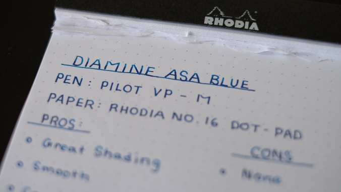
The shading is one of the major things that drew me towards this ink. I love blues that get darker with bigger nibs, it allows for more experimentation and manipulation when writing. Asa Blue shades very well as seen in the picture above, and past a certain point, I got the hint of a red sheen.

DSCF7032

Overall Asa Blue has been one of the best Diamine inks I have ever tried. The color and shading make for an excellent everyday blue that can walk the fine line between fun and whimsical, to serious and professional. It performed very well on the variety of papers I used to test it with little variation. After only a month, I polished off a 30mL bottle which in itself shows me how much I love this ink. All I can say is, if you love blue inks, you have to give this a try. Well, it’s time for me to go purchase some more and hope Diamine offers it in sizes larger than 80mL :P. Look forward to tomorrow’s review, and as always, write on, my friends.

Short Break

Hello Everyone,

I just wanted to inform you due to my finals being this week, there will not be a review. I know I didn’t post a review for last week either, but I plan to make it up after my last final on Friday. I think a Spring Break review blitz is in order. It’s that time of the year again. Time for some new school supplies (aka more fountain pens and stationary). So I think a review a day for week following finals should be good. I plan to finally get around to all the ink reviews that have been accumulating over a while. It’s gonna be fun, so look forward to it! 🙂

Sincerely,

Anchit, The Passionate Penman

Uni Signo DX 0.38mm Review

DSCF7021

The pen that started it all. One of my first pens from JetPens. The most prominent one I can remember. I’ve been fastidiously using this pen for going on 2 years now. To this day, I just can’t imagine a better pen. I’ve been searching around for a while, but I end up coming back to this one every single time. So let’s dive in and see why this is one of the most perfect pens for me.

DSCF7027

Predictable, right? If I had a quarter for all the time I spent brainstorming and typing up a rant about grips, I’d be a couple million dollars richer. All jokes aside, I hold the Uni Signo DX’s grip as my gold standard in utility and comfort. It seems that Uni really hit the nail on the head when it comes to pattern and thickness. The rubber is thick enough to provide a decent amount of cushion, while at the same time keeping in line with the pen’s slim form. The pattern is a rather simple linear group of dual columns wrap their way around the grip, leaving a few spots with just plain rubber. This grip is the most effective in function that I’ve ever had the pleasure of using. Well played Uni, well played.

DSCF7026

I had a certain hesitation when it came to using this pen at first. It was my first foray into micro tip gel pens, having used mechanical pencils for the longest time. I used to be that kid who still used 0.7mm pencil when everyone else used 0.5mm. I had no choice but to keep track of my lead supply, otherwise I was out of luck in finding anyone who can spare some. The fact that I would be using a pen for schoolwork that would be graded just didn’t feel right, I felt that there were so many things that could go wrong, but I decided that just trying it out for a couple weeks wouldn’t be too hard. I started using the DX the moment I unwrapped it from the copious amount of bubble wrap that it was encased in. After a few sentences, I felt a lot better about the prospect of writing with it. The in flow was smooth and consistent, almost negating the small amount of feedback I felt when using it. All my lines were crisp and clean, perfect for my writing style at the time, a hybrid of block and cursive. As the months went by, it wasn’t until the pen ran out 4 months later that I noticed exactly how long I had been using it. the fact that I lost track of time spoke volumes to me, about how amazing this pen was. I knew that I had to order more.

DSCF7025

The clip is one of the aspects of the pen that I really can’t talk about too much as I’ve never kept this pen in a shirt pocket (I don’t usually wear shirts with pockets). I’ve almost exclusively kept it in my Nock Co. Hightower that I take to school with me every single day. I’ve been using this particular DX in the photographs for almost 5 months now and the clip still looks as if its brand new. I don’t see the traditional slightly upwards bent state that some of my other pen clips have shown after constant use (namely, sliding them in and out of my pencil case).

There you have it folks, the reasons why I think that this is my perfect micro tip gel pen. The grip is slim, yet comfortable, the tip lays down a smooth and consistent line and the clip is rugged and reliable. This pen satisfies and goes beyond all the standard requirements I have for gel pens and that’s why it is #1 in my Top 5 Pens list under Gel Ink Pens. Give it a try and see what all the fuss is about. Until then, write on, my friends.

Maruman Mnemosyne Notebook

Hands down the best paper I’ve ever used! To me, Maruman Mnemosyne paper is the gold standard of fountain pen friendly paper. It is the paper that I use for almost all my schoolwork, whether it be note-taking, homework, writing assignments, etc.

DSCF7012

The Maruman Mnemosyne I use is sized at B5, measured at 7.4 by 9.9 inches with 7mm line rulings. The binding is a double ring, ensuring a smooth flip as well as being able to take a beating (the stories I could tell you…). At the top there are sections for Date/No. and a Title. The lines are all a cool grey making the rulings very subtle and less distracting during use. There are 80 pages that are micro-perforated, allowing for easy tearing. All the pages are acid-free, meaning they won’t yellow over time, making it great for storing notes and the like. Each page is split up into 3 different sections of 10 lines each. I found it very helpful as I used those 10 lines as guidelines to keep what I wrote to a minimum that encapsulated the main points of the section.

Why do I love this paper so much? It is the smoothest out of all the papers I’ve ever tried. Nothing I have used short of Tomoe River has been nearly as smooth. With a slightly larger nib, I feel the pen gliding over the paper. My favorite pen to use is my Pilot VP with a medium nib. After it was binderized, it felt smooth no matter what paper I used it on, even copy paper. I feel that the Maruman brings out the best in it, though.

DSCF7013

Another great reason I love Maruman is the absorbency. On Rhodia paper, it takes a little longer for inks to dry allowing for many potential mishaps and accidental swipes occur. Not with the Maruman! While it doesn’t dry instantly (if only), the dry times on the Maruman is noticeably less than on Rhodia.While absorbent, it also is very resistant to ghosting, which made it possible for me to use the other side of the page without any hassle. The absorbency was displayed to me on accident one day when I was fiddling around with my converter. I think I was frustratedly trying to push the ink to the front as the nib was drying up. I twisted a touch to hard and the ink dropped onto the page creating a large blob. Panicking, I desperately tried to spread it out across the page to prevent it from soaking through (yes, it can possibly happen). I spread it out and waited for about a thirty seconds before daring to turn the page. To my great surprise, the ink blob had mostly dried, other than the very center. The other side was also completely usable despite what had happened.

DSCF7020

So I’ve been praising this paper a lot so far, but now I will address one of its less attractive aspects, the price. The price for the Maruman notebook I use is $11.25USD on JetPens. Rhodia, on the other hand, doesn’t offer any of it’s notebooks in the B5 size. So for the sake of comparing prices, I will use two notebooks of the same size: A4. The price for the Maruman Mnemosyne A4 notebook is $15.50USD. The price for a Rhodia Pad No. 18 is $13.75USD. For the same size, you would be paying $1.75USD more. So it all comes down to: Is the premium worth it? I wholeheartedly say yes, it is. The quality and experience provided by the Maruman is significantly better than the Rhodia in my humble opinion. When I’m writing on the Maruman, I feel how absorbent and smooth it is, I see how the ink pops on the page and I feel the quality oozing from the design. What can I say? You get what you pay for in this case. Keep in mind this is simply my opinion. It is up to you to try the Maruman Mnemosyne out and then make your decision on your willingness to pay. It is subjective for everyone, but I have a hunch that many people will feel the same as I do.

As I mentioned in the beginning, this is hands down the best paper I’ve ever used. I honestly can’t believe how long it took me to get around to this review despite using and loving this paper for so long (approximately 2 years now). If I had a choice of using only one kind paper for the rest of my life, this would be it. If you can get over the slight premium over standard Rhodia paper, you’ll find out why me and many others love this offering from Maruman so much. What are you waiting for?

Disclaimer: I am in no way affiliated with JetPens. I used the prices on their site as it was simply where I have gotten my notebooks from since the beginning. At the time, Goulet Pens was not offering Maruman products, something that changed rather recently. So while the prices may differ from store to store, I’m pretty sure the price disparity between Maruman and Rhodia will stay the same.


Uni Signo RT1 Review

Note: A thousand apologies to all my dedicated readers. In my infinite wisdom I scheduled the review for today and next week instead of last week and today. I was wondering why nothing was happening on my blog… derp. I shall endeavor to appease by putting this one(last week’s review) out today and this weeks review out tomorrow. Two reviews in one day would be rather strenuous. Along with these two will also come next weeks review, as an apology.Tomorrow’s review involves paper. Feel free to guess in the comments section or on IG or Twitter. Studying for my second round of midterms made it a little difficult to check out the blog stats. I’ll make sure to check at least once whether my scheduled posts go up. Thank you for all your support, I couldn’t do this without you. Now on to the review.

DSCF7004

DSCF7006

The tip is a small size (0.38mm), but it lays down a smooth crisp line that glides over the page, albeit with a little bit of feedback due to it’s extra fine nature. I couldn’t be more happy with it as I felt it’s performance was similar to the vaunted (and rightfully so), Uni Signo DX 0.38. This pen feels like it’s futuristic, retractable cousin.

DSCF7007

The clip is integrated into the knock. It is rather convenient as it really seamlessly blends into the pen allowing the clip to remain out of the way while maintaining function.

DSCF7008

Doesn’t it look like a futuristic rocket ship? I tried so hard to get this one shot until just the two tips were clearly in focus. Looks pretty cool to me.