Stressing in Spring

Hey Everyone,

It’s been a while and I’m sorry for not updating you quicker. This is the week of my first set of midterms, therefore making it one of the most stressful weeks in the entire quarter not counting finals week. I’ve been doing nothing but studying for hours on end and couldn’t put out a review. Honestly, even if I could, I deemed that I hadn’t spent enough time using the pen to form my opinion. I want to be able to use a pen enough to ensure a fair and unbiased review based on actual usage and not first impressions. Please bear with me as the stress just escalates from here until the start of summer. I will do my best to try and put out reviews every week, but I want you guys to know that that may not be possible. Thank you for understanding and as always, write on, my friends.

Sincerely,

Anchit, The Passionate Penman

Staedtler Pigment Liner 0.3mm

Sorry for not posting the review earlier as Comcast was updating the lines for the network. The WiFi has been on and off for nearly two days now. I had schedule it to post yesterday, but that didn’t happen because no WiFi. Anyway here’s the review for last week. Enjoy! 🙂

DSCF7184

This pen is hands down my favorite drawing pen of all time. I have gone through more Staedtler Pigment Liners than any other drawing pen I’ve used. While similar in aesthetics and design to the Sakura Pigma Micron, the Pigment Liner has a couple of features that I personally appreciate more. The first feature being the body. While the materials used to crate both pens are pretty much the same, the Staedtler Pigment Liner just feels better in the hand. I attribute it to the textured feeling of the barrel that hints at a solidly constructed pen, instead of the feeling of plastic on the Pigma Micron. To me, it just feels better. Remember that this is simply my opinion and I personally enjoy feel of the Pigment Liner. I leave it to you, dear readers, to try both and form your own opinion.

DSCF7193

The second feature is the tip. When I tried out the Pigma Micron, I was so surprised by how hard the tip was. Gradually it lost that feeling as I tended to have a bit of a heavy had back then when I reviewed it, but nonetheless, starting out, it was like writing with a nail. While it definitely delivered on the “sharp” and consistent lettering, I found it hard for me to get used to.

DSCF7190

The Pigment Liner’s tip is slightly on the softer side, allowing for more forgiveness for those who write with a bit more pressure. At the same time, despite any pressure exerted on it, it delivers crisp and consistent line that allows for some great lettering. While I can appreciate the rigidity of the Pigma Micron, the softness of the Pigment Liner just mad eit that much easier for me to use and love.

DSCF7188

The cap is pretty standard. fora  drawing pen. Most other pens of this type adopt similar designs. It’s just a slightly thin, bendable piece of metal that has a little notch at the end for grip. It’s functional and on the first try, I was able to slip it into my Nock Co. Hightower without too much resistance.

DSCF7187

The ink is pretty standard for a drawing pen. It mirrors muh of it’s competitor’s properties without any extra additions. It’s archival quality, fade-resistant and due to it being a pigment based ink, it is waterproof on paper.

For those of you looking for a slightly more forgiving alternative to a Sakura Pigma Micron, the this is your best bet. Clocking in at about $0.80 more per pen than the Pigma Micron, it’s a great addition to any pen addict’s arsenal. It’s one of my most highly rated and preferred drawing pens out of all the ones I’ve tried. I feel that despite being on the more expensive side of the drawing pens line up, it’s worth a try. So what are you waiting for? Go out and get one to see what all the hype is about! Thanks for reading and as always, writ eon, my friends.


Pilot Hi-Tec-C Maica 0.4mm

DSCF7174

While I was a little intimidated by the JetPens description, I must admit this is a very well executed revamp to an absolute classic. The ink is the same as the one present in the Pilot Hi-Tec-C, but for some reason, I felt like it performed better than the original. JetPens did a comprehensive guide to Hi-Tec-Cs and the weight listed for the Maica and the Hi-Tec-C were the same at 0.40oz. They go on to mention that the Maica is an abbreviation of “my color”, which makes total sense seeing as the Maica is available in a veritable rainbow of colors.

DSCF7176

The body is slightly heavier ad more “filled out”, resulting in a rounder profile. The cap is flush with the body. This means that there is a ridge formed near the grip area. Unlike many other pen companies that would simply leave it be, Pilot took the initiative to round out the edges, so props to them for paying attention to details.

DSCF7178

The grip is still not that good, but feels much better than the original in my opinion.While the little bumps don’t help too much, they are more functional than the straight lines on the original Hi-Tec-C.

DSCF7177

I’m not too crazy about the jewel on the cap that sparkles lie “my favorite jewelry”, but it’s not as distracting as I thought it would be. While by no means subtle, it doesn’t look too ostentatious and strikes a nice balance with the pens luxurious design.

DSCF7179

There will be no charms strung through the cap loop for added “pizazz”, but it doubles as a very functional and minimalistic roll stopper.

Rest assured, you don’t have to be a teenage Japanese girl to enjoy the design choices on this pen. I for one think Pilot did a great job on the overall concept and would love to see another revamp, hopefully with a rubber grip that’s comfortable. Thanks for reading and as always, write on, my friends.

25,000 Views?!

Hello Everyone,

How are you doing? Just wanted to give you all a quick update. As of yesterday, The Passionate Penman just broke through 25,000 views. It’s so nice to know that so many people from around the world are seeing my reviews. Thank you for all your support. I hope you continue reading and look forward to all the reviews that are coming your way. I’m constantly trying to improve my review style and pictures. I hope that you all will leave a comment when you can and give me some feedback. On to the next big milestone, 75,000 views. Let’s get there guys! Have a great weekend and as always, write on, my friends.

Sincerely,

Anchit, The Passionate Penman

End of Review Week

Hello Everyone,

Yesterday’s posts marked the end of review blitz week.

I would like to explain what happened on the day you expected 2 reviews but got none. I was composing those reviews well set midnight, and when it came time to schedule the posts, I set it for the day after instead of the day of. Silly mistake, I know. So I published 3 reviews yesterday. The 2 that were owed along with a new one. Thanks for being patient with me. Tomorrow, I go back to school refreshed and ready to take on another quarter. Another review will be published for this week and will go back to 1 review a week. Thanks for reading. Don’t forget to follow me on Twitter and Instagram for updates.

Cheers,

Anchit, The Passionate Penman

Sharpie Fine Tip Pen

DSCF7113DSCF7116

The clip is a rather flimsy piece of plastic. It really isn’t very functional even on the day I bought it.

DSCF7120

The tip is surprisingly sturdy. I put varying amounts of pressure on it from different angles, but it maintained a crisp and consistent line. While the tip is similar to other plastic tip markers I’ve reviewed in the past this was by far the most solid of them all. It’s very forgiving of the writer as it can adapt to any writing style.

DSCF7121

My biggest complain against this pen is the grip. It is uncomfortable due to it’s size. The section that I usually grip is diminutive and feels awkward in my hand. The steep transition between the body and grip section further distract and take away from the writing experience. I generally used this pen for quick notes and not long writing sessions, while I haven’t been able to test it, from what I experienced, it wouldn’t be very comfortable. I found myself constantly readjusting my grip every 15 seconds as I just couldn’t find a sweet spot.

DSCF7122

The back where the cap posts is a little loose and doesn’t retain the cap very well. I found the cap slipping on many situations. This didn’t happen when I first bought the pen though, this problem started cropping up 2-3 months down the line, which became very annoying after a while.


Kokuyo Campus B5 Notebook

DSCF7135

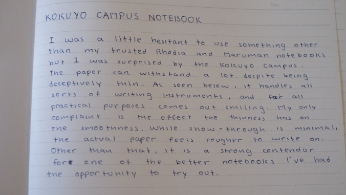
The thought of using something other than Rhodia and Maruman paper threw me for loop. I’ve been using the two for nearly 3 years now and have yet to replace them with anything else. So it took a leap of faith for me to order this notebook. All in all, while not the best I’ve ever used, it definitely didn’t disappoint.

DSCF7136

This paper is deceptively thin, which reminded me a lot about Rhodia paper. It was almost see through when I first brought it to class. I wasn’t confident on it’s performance at all, but was in for a little surprise. This paper soaked up ink like a sponge, but the surprising part was, there was no feathering or bleed through. When I checked the back of the page after finishing my first page, I was stunned by how little the writing on the other side showed through. While at first I used my Platinum #3776 with a fine nib, I transitioned over to the Pilot VP halfway, as I was confident that the Kokuyo Campus Notebook could handle the amount of ink it laid down.

DSCF7132

While it does absorb ink with little show through, I was a little disappointed in the smoothness. My favorite paper, Maruman Mnemosyne, does a great job of balancing the smoothness with the absorbency, but that was not the case with this paper. It was thin, but had a much more rougher writing surface. I was astonished by how much feedback I was getting on my Pilot VP. A pen which usually glides over any and all paper I use with it was actually giving me feedback on this paper. This was something I found I just couldn’t handle, as it took away from the kind of writing experience that I prefer. Don’t get me wrong, it is a great paper if you’re not particular about smoothness, but being one of my main critical points, I didn’t enjoy using it as much.

Witch Pens Review

DSCF7123

Now this is one calligraphy tool I’ve been dying to review. I was initially exposed to Witch pens through a review by Leigh Reyes. The concept behind them is so simple, yet so efficient. The name is also pretty awesome, Witch pen (a contraction of William Mitchell).

DSCF7124

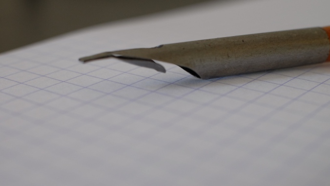
The design of the pen is simplistic yet utilitarian. The metal bends backwards to create a reservoir right underneath the nib. This allows the user to transition between fountain pen inks and other more viscous inks such as iron gall or sumi.

DSCF7128

The nib is a folded piece of metal that allows for easy use on many different papers. While I used it on a smooth Rhodia paper, I’m certain that I can definitely use it on some more textured kinds of paper such as cold-press watercolor paper. The way the nib is designed, it will provide a smooth writing experience on many different surfaces.

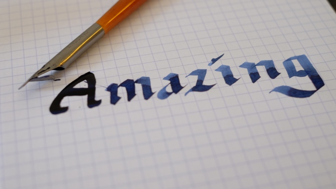
The Witch pens are a great starter for all those interested in broad edge pen calligraphy. While fountain pen inks do run a little, I have had positive results with gouache, some thick watercolor paints, as well as sumi and McCaffrey’s ink. My only gripe is the cleaning process. It is a little difficult to clean these pens thoroughly, with the only method being immersing them in water and then drying them out on paper towels. It is a little time consuming, but well worth it for the fun I’ve had.