Identity Crisis

Hello All,

Thank you very much for the views and comments. I cannot believe that in the short space of one month, I have gotten nearly 2K views (1.9K as of writing this). I have figured out that the only way to illicit a response from you guys is to bash a product 😉 . In the upcoming weeks, you will notice that the theme of my blog will be changing multiple times. I feel that this theme is a little cramped, and I want something a lot more fluid and responsive. Don’t get me wrong, it’s not a “bad” theme in any sense of the word, but just not what I’m looking for taking into account the subject matter of my blog. Don’t panic if you see a completely different looking blog every week (or day). I will be going on a journey of self discovery as I sift through themes until I find one that truly embodies the purpose of this blog while meeting my aesthetic preferences. So until then, let the ink flow.

Sincerely,

Anchit

A Penman’s Lifeblood

Why did the pig have ink all over his face? Because it came out of the pen!

Sorry for the less than original punchline, but this post warranted a joke about ink, of which there aren’t many clever ones out there. (If you know any better ones, tell me in the comments 😉 )

So I realized that it has been a little more than a month since I started my blog, and in my first post, I had mentioned that I would do ink reviews. 7 posts later, and still nothing regarding the ink. I would like to apologize to have kept all of you waiting, and want to say that I am going to rectify this situation immediately. I ordered some ink samples from Goulet Pens 2 days back, and they just came in the mail today. I say “some”, but that wouldn’t be the word others would use to describe this haul.

It's too beautiful for words

It’s too beautiful for words

IMG_0077

Varying brands and colors

IMG_0078

A little bit of everything

IMG_0081

I love it when the light hits the ink perfectly

For those of you who want to know the exact list of the inks, here you go:

  • Diamine Oxblood
  • J. Herbin Eclat Di Saphir
  • J. Herbin Poussiere de Lune
  • J. Herbin Gris Nuage
  • Iroshizuku Yama-Budo
  • Iroshizuku Shin-Kai
  • Noodler’s Apache Sunset
  • Noodler’s Bad Blue Heron
  • Noodler’s Blue Eel
  • Noodler’s Liberty Elysium
  • Noodler’s 54th Massachusetts
  • Organics Studio Arsenic
  • Organics Studio Blue Merle
  • Organics Studio Edgar Allen Poe
  • Pelikan Edelstein Tanzanite
  • Rohrer & Klingner Scabiosa

I’m sure you all recognize at least a few names on this list. Since I am relatively new to reviewing inks, you might see my review style change as I try to find the one that is most effective. Look forward to new ink reviews every week! I hope you all are as excited as I am to try out these beautiful and expressive colors!

I encourage my readers to share their thoughts in the comments below on which one I should review first. I wanted to start a poll but there are too many options. Comment away my friends!

Ohto Graphic Liner Needle Point Drawing Pen – 005 Review

IMG_0074

I picked this pen up on a recommendation from a friend, and I have to say I was surprised (in a good way). I was expecting a standard plastic tip drawing pen like the Sakura Pigma Micron, but got something a lot better. A metal-tipped drawing pen which stays true to the needle point part of it’s name, can take a severe beating, and forgive the heaviest of hands. When I discovered it to be metal tipped, I thought it would be scratchy on cheap paper, but how wrong I was to assume that. After an initial hard start, the ink started flowing smoothly, and formed a little dome over the tip, which allowed me to change writing angles effortlessly. The 005 initially confused me, but after reading some reviews on JetPens, I found out that the tip width is 0.3mm.

One of the problems I ran into in the beginning was that the ink flowed almost too well, and ended up pooling when I touched the tip to paper after a short break. This problem goes away after the first 5 times you write with the pen. I didn’t mind, but it might bother some people, so just a heads up. Other than that, I didn’t find anything else that could be an issue.

See what others think:

Ohto Graphic Liner Needle Point Drawing Pen 03 Review – Pen Addict

Ohto Graphic Liner 0.3 – The Well-Appointed Desk

Ohto Graphic Liner Needle Point Pens 005 + 02 Review – THE UNROYAL WARRANT

OHTO Graphic Liner pen review – Pens! Paper! Pencils!

Note: Sorry for the blurry pictures. The camera I was initially taking photos with was taken on a trip. I’m currently using a 6 year old digital dinosaur with focusing issues, so please bear with me.


Pilot Falcon SF Review

Pen: Namiki Falcon SF nib with Rhodium trim

Ink: Iroshizuku Kon-Peki

INTRODUCTION:

I was introduced to the Namiki falcon while perusing YouTube for calligraphy videos. I stumbled upon one which showcased the Falcon with Mr. John Mottishaw’s Spencerian customization. As of this blog post the number of views on the video has gone past 4 million. Here’s the link if you guys are curious Custom Namiki Falcon. Anyway, by the time I watched the video and decided that I wanted one, Pilot was debuting the new rhodium version of the falcon, so I jumped at the opportunity and got one. I opted for the resin version, but there is another full metal version of the same pen which runs on Pilot’s CON-70 converter which holds a lot more ink than the CON-50, which is what the resin version comes with. I was tempted to get the metal version, but a $100 more in asking price, I decided against it.

APPEARANCE:

Namiki Falcon in Rhodium trim

Namiki Falcon in Rhodium trim

I guess it’s a personal preference, but I feel that a gold and black color scheme makes a pen look much more gaudy than it needs to be. Silver, (or in most cases, rhodium) and black have a very subtle contrast that really grabs my attention. A silky, svelte black with a few pops of shiny silver really appeals to me in a way a black and gold pen never can. This smart looking pen looks like it would be perfect for any occasion, whether you’re taking notes in school, or signing autographs at a black tie dinner.

Falcon hooded nib

Falcon hooded nib

Underside of the nib

Underside of the nib

NIB & PERFORMANCE:

Despite the numerous compliments I gave this pen for it’s appearance, I have little in the way of praise for it’s performance. I really looked forward to using this pen as a quick note taker. I had asked Brian Goulet of the Goulet Pen Company (no affiliation) on what nib size I should look into after he did a promo video for the incoming Falcons. I wanted a quick note taker, but didn’t want to consume too much ink. He recommended I get a soft fine, and almost immediately, I pulled the trigger. After the pen arrived, I inked it up and took it to school the following day. The first few lines were velvety as the nib glided across the page, laying down a relatively thin, yet visible line of ink. 5 lines in, the experience took me straight down the gutter. The smoothness had lessened considerably, and the nib couldn’t keep up with my writing speed. Now I DO NOT write fast, in any sense of the word. At least not as fast as most people think. I tend to take my time when I form the letters to ensure the legibility. The frustration I experienced as I tried to keep on writing cannot be described in words. (Well it could, but then I’d have to censor everything past this point) After that first day, it has been sitting in my drawer collecting dust until I dug it up for this review. Even as I was making the handwritten review, I was running into problems, as you can see for yourselves.

IMG_0019IMG_0018

OVERALL:

This is one of the best looking pens I own, but I am not at all satisfied with the performance. I know it can’t be a problem with the nib as Goulet Pen Company ALWAYS checks the nib before sending out an order. Any suggestions on how to improve the experience? Should I send it to a nibmeister and ask for improved ink flow? Should I sell this pen and get another one that will make me happier? Let me know in the comments below!


Pendleton’s Pens “Lumi” Review

INTRODUCTION:

The TWSBI Diamond 580 series. Not much can be said about the diamond series pens that hasn’t already been said. The current version I am reviewing is the 580AL. The difference between this and the older 580 is the material used. Instead of the traditional plastic we saw used for the grip and piston rod all the way from the 530, TWSBI has opted to reconstruct them with aluminum. How did I know it was aluminum? The chemical symbol of aluminum is Al (•_•) / ( •_•)>⌐■-■ / (⌐■_■) (*YEEEEEAAAAAHHHH) I’ve definitely learnt something from chemistry class.

This change gives the pen a nice heft, making it feel very solid and sturdy in my hands. The weight of the pen is also directed towards the front, which helps me write with less overall pressure. I purchased this pen from Pendleton’s Pens, and was extremely satisfied with the professionalism demonstrated by Mr. Brown, as well as the fast shipping.

*drools*

*drools*

APPEARANCE & PACKAGING:

The TWSBI 580AL has a very simple yet elegant appearance. The chrome pieces and aluminum grip section provide a subtle, satisfying twinkle when it hits the lights at the perfect angle. When capped, I noticed that there was a stark contrast between the plain cap and the multifaceted diamond pattern found on the body. When uncapped, this pattern helps the pen not roll off the table (almost happened to me, I completely freaked out >.<).

Finally Here!

Finally Here!

Simple, appropriate for price range

Simple, appropriate for price range

NIB & PERFORMANCE:

I had mentioned in my teaser post that there was something special about this pen. Well here it is! The nib on this pen is absolutely mind-blowing. I was dubious whether a stub nib was what I needed, but now I can say with certainty that they are perfect for notes. Now being a college, I am expected to write a LOT of notes. On average I write almost 11-12 pages per subject everyday. I was thoroughly confused about the nib size that was ideal for me, so I sent an email to Mr. Pendleton Brown detailing my quandary. I wanted a nib that had decent line variation for my calligraphic pursuits, but did not consume copious amounts of ink. Smooth as butter, but crisp enough for intricate details. Fine, but not too fine.

In all honesty, I didn’t know whether what I was asking for was possible, or even realistic. However, within 24 hours, Mr. Brown emailed me with his recommendation. He was prompt, concise, and professional with his recommendation. The nib size he recommended for me was not something that was shown on his website, a “Fat Fine”. His description of it was “fatter than a fine, thinner than a medium”, which turned out to be 0.5mm width. Putting my faith in his expertise, I pulled the trigger. 3 days and $110.00 later, I find myself in nib nirvana. He really knows how to identify what a customer is looking for! Kudos, Mr. Brown 🙂

Nib Close-up

That nib looks so beautiful up close!

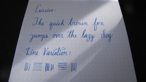
I have very limited experience with stub nibs, so at first I found the nib to be really scratchy, and I was disappointed as I was expecting something buttery. Then after 20 minutes of experimentation, I realized it was because I was a total noob, that it was even doing that. I took a few deep breaths, relaxed my grip, brought the nib to a light hover on the paper and moved my whole arm when writing. Instantly the nib glided across the paper with almost no effort. I got a sense of pure joy and elation as I wrote out my first comprehensive handwritten review for this pen.

Handwritten Review

Handwritten Review

Cursive and Line Variation Tests

Cursive and Line Variation Tests

OVERALL:

Pros:

  • Solid construction
  • Juicy, and springy nib
  • Interchangeable with standard TWSBI nibs
  • Great ink capacity
  • Comes with silicone grease and wrench for disassembling

Cons:

  • More expensive than a standard TWSBI 580AL
  • Doesn’t post well

CONCLUSION:

I would recommend anyone to get a custom Pendleton Point BLS Italic nib. They are juicy, springy, and smooth. I couldn’t be more happier with my purchase. This pen has earned a permanent spot on my EDC list. I look forward to trying out a few new scripts with this pen, which I will hopefully be able to show you guys later on.

DISCLAIMER: I am in no way affiliated with Mr. Pendleton Brown, and was not compensated in any way for this review. I am just another happy customer. 🙂