J. Herbin Bleu Nuit

DSCF1633

It took some real effort for me to decide to switch up my daily driver ink for another. Usually, I make sure to keep a stable pen that I know I can depend on with an ink that I can trust to not mess up when I’m using an ink I’m going to review in the future. I’ve had bad experiences before with missing an entire class worth of notes because the ink I was testing didn’t properly go with the paper I was using and started to bleed through. After a couple of those experiences, I made sure to always have a backup ready just in case. This semester, I didn’t take as many fountain pens to Indiana, because I wanted to stick to the bare minimum because cleaning can become a hassle. I stuck to my trusty Lamy 2000 and TWSBI ECO. For the entirety of the last semester, I had the Lamy inked up with Iroshizuku Shin-Kai, which quickly became a daily driver of mine and I’m almost finished with the bottle. I needed to review Bleu Nuit, but my TWSBI was already inked up with Bleu Pervenche. So I decided that I needed to switch things up a little bit.

DSCF1635

Bleu Nuit is an interesting ink, because of the way it looks straight out of the bottle. Honestly, I was initially skeptical of the color because I saw both the grip of my pen and my hand being stained with a purplish blue color and thought that maybe this was going to be reminiscent of Diamine Midnight. However, once I actually used it, it turned out to be a true neutral blue-black ink. Directly from the nib, it holds a purplish color, but dries to become blue-black with hints of grey undertones. Unlike Diamine Midnight, which acted the opposite way and caused me to dislike the end result.

DSCF1636

It has all the characteristics that one would expect of a J. Herbin ink. It’s lubricated, well-behaved and there is a decent amount of shading. This was especially accentuated through my use of a slightly wet medium Lamy nib. I’m sure the shading would be turned down if used in a fine or extra-fine, so that’s something to keep in mind if shading is something you look for. As I mentioned above, the color you see in the ink bottle and directly from the nib can confuse you, but be assured that it dries to a neutral blue-black. I honestly enjoyed watching it drying as it looks similar to how Shin-Kai looks when it has dried.

DSCF1641

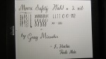
One thing that might be a bit of a drawback with this ink is, as always with J. Herbin, a little bit on the expensive side. The 10mL can be bought for $5.50 on JetPens (not sponsored) and the 30mL can be bought for $12.00 from all your favorite pen shops. On the other hand, Diamine Blue-Black, another great blue-black ink, is priced at $7.50 for 30mL. My advice would be to get the 10mL to test it out and decide if you like it before purchasing any larger sizes.

J. Herbin Bleu Pervenche

DSCF1586

I’ve had this ink for a long time and just got around to writing a review now. I saw that J. Herbin was selling tiny bottles of ink for very affordable prices and couldn’t resist getting some. When it comes to reviewing, one thing I have to worry about is the cost of the inks. I have to constantly decide whether a whole bottle of ink is worth it and if I’ll even be able to use all of it. I really like using the ink for at least a minimum of 2 weeks mainly for writing notes. With the amount of notes I write, an ink sample is not enough at all to experience and then review.  That’s mainly why the tiny bottles of J. Herbin were perfect to get a good amount of writing done and not break the bank.

That being said, it is a little inconvenient to fill up a pen with a bottle this tiny. The opening is barely enough for the Lamy 2000 and only smaller pens would be more easy to fill up. The TWSBI Eco was pretty easy to fill, but I’m predicting it won’t be as easy once the level of ink goes below a certain point. Then it will be an interesting experiment to find an efficient way to fill up my pens without creating a mess.

DSCF1592

One thing that really appealed to me right off the bat was the vibrancy of the color. When filled up inside a demonstrator pen like the Eco, the ink looks much darker and its a surprise when the nib touches the paper and a bright blue is all you see. I used this ink in multiple pens from the TWSBI Vac Mini, Lamy 2000 and the Pilot Custom 823 and it was well-behaved in all of them, as I’ve come to expect from J. Herbin inks in general. The ink is decently lubricated and flowed well out of all the pens I tested it in. When writing with some different nibs, I noticed that there was good shading from an EF to M nib and while it may not be apparent from the photo, the sheen on the ink is slightly red in places where it pools. It might be my eyes playing tricks, but I also see hints of green too. It’s a pretty looking ink that any lover of light blue inks would like.

DSCF1595

While Bleu Pervenche has all those great characteristics, it also has some drawbacks. The one I experienced the most frequently was feathering. This ink is very finicky on the type of paper you use it with and the only type that worked perfectly for me was Rhodia. Even the Maruman Mnemosyne notebooks which I absolutely love and are tanks when it comes to inks, showed signs of feathering when I wrote notes. This was most prevalent when I adjusted the amount of ink due to some skipping with the TWSBI. With that, the dry times I experienced were north of 15 seconds on Maruman paper, which became a huge hassle as I had to wait for the ink to dry before turning the page to continue taking notes. I had made the mistake of not waiting a couple of times in a rush and the back of the notebook got stained and the letters got obscured.

DSCF1596

Overall, Bleu Pervenche is a very well-behaved light blue ink that has decent lubrication and great shading. It works really well with Rhodia paper, but if you don’t mind some feathering, most other notebook brands like Maruman and Kokuyo will work fine. Depending on the nib you use, your dry time may differ, but I would recommend for those using M nibs and above be aware of the slightly longer dry times and compensate for them accordingly. Other than that, I recommend picking up a small bottle of J. Herbin’s Bleu Pervenche to try out.

J . Herbin 1670 Emerald of Chivor

This was an ink review in the waiting for the last few months. I’ve been meaning to get around to it for a long time, but it just never happened with how hectic my schedule was. After a lot of delays, I finally decided that the first review of the summer, will be this. Without further ado, let us jump right in to my review of J. Herbin’s Emerald of Chivor.

The box it came in was very nicely detailed and shone exquisitely when it reflected the sun. The drawing was absolutely mesmerizing and a very nice touch to a somewhat luxurious product. Initially, I was very reluctant to spend $26 on a bottle of ink, but I bought my ticket and boarded the hype train. Looking back, I have no idea why it took me so long. Everything about this ink drove me absolutely crazy for it since my first use in my FC Model 40P. It retains all the great characteristics of a standard Herbin ink while adding an extra component that makes this ink shine(pun intended 😉 ). I also love using it in my Pilot Parallel pens because the ink just exhibits its characteristics much more beautifully when it’s used with a juicy, 6.0mm nib.

The one thing that makes a hype train possible is a unique characteristic that you can’t find anywhere else. For the J. Herbin 1670 inks, it’s the gold flakes that allow for some sparkly handwriting that glitters in the light. Seeing its commercial success, Diamine jumped aboard the gold flakes hype train, but failed to recreate the Herbin experience (more on that later). The beautiful teal color of the ink meshes really well with the gold and creates a stunning contrast that’s very pleasing to the eyes. My only gripe is that it is pretty expensive, making me hesitant to use it more liberally than I usually would. Other than that, I highly recommend it to anyone looking for a change in their usual ink or those who love sparkly inks.

Karas Kustoms INK Fountain Pen Review

The fact that Karas Kustoms was there at the L. A. Pen show came as a very pleasant surprise. I entered the hall, looked around, and there, tucked into a quiet corner, was the Karas Kustoms table. There sat Bill Karas and Dan Bishop, the brilliant minds behind the Karas Kustoms pen line. I walked up and Dan greeted with a warm, welcoming smile which disarmed me completely. I stopped being so nervous, and we started chatting about their solid, well-designed pens, that I salivate over.

DSCF2556 DSCF2558

Karas Kustoms on Instragram

KarasKustoms.com

I had been looking at the INK in black body/brass grip combo for the longest time, but it was constantly sold out by the time I had earned enough to get it. Incidentally, I was looking forward to getting a Spencerian grind on my Falcon, but was informed that John Mottishaw doesn’t work on pens not bought from Nibs.com. This came as a huge disappointment to me, but it also cleared about $110 of my budget, allowing me to re-purpose it towards getting an INK in my dream combo. Best of all, Dan kindly knocked $10 off the original price, which helped me save enough to buy another dream pen (a story for another review).

Continue reading

Moore Safety with Wahl #2 nib

This subtle beauty of a flex pen comes straight from the website of the illustrious Greg Minuskin. This was my first fountain pen that got me into vintage flex pens and Copperplate calligraphy.

IMG_2635

Pen: Moore Safety with Wahl #2 nib by Greg Minuskin
Ink: J. Herbin Perle Noir

This pen is an absolute joy to use. The Wahl nib is especially responsive making anything from hairlines to bold downward strokes a breeze. It took me a little while to get the feel of the pen, but it became progressively easier. I found it easy because I used to always write in cursive as a kid. The stroke order and flowing motions was something that we had to practice back in my preschool in India.

Was my first time dealing with a lever filler.  Pretty easy and convenient to fill.

Was my first time dealing with a lever filler. Pretty easy and convenient to fill.

I did a bit of research on how lever fillers work after I first used this pen. I found plenty of diagrams about how the lever pushes a sac inside the pen that when you snap the lever back into position, the ink is sucked up into the feed and fills the sac. The best analogy I can think of is a filling a dropper. (I’ve been taking Chemistry classes over summer)

Sorry for the poor lighting.

Sorry for the poor lighting.

Here’s another picture of the main section of the pen. The entire body is BCHR (black chased hard rubber). The ripples on the pen cap look really nice under the proper light. One thing I possibly found a problem was with my grip, which was hard to properly maintain for long writing sessions. The only thing that was somewhat securing my grip were the cap threads.

Had to post the cap, otherwise the pen is too small for my hand.

Had to post the cap, otherwise the pen is too small for my hand.

DISCLAIMER: I am no way affiliated with Greg Minuskin, and was not compensated in any way for this review. I am just another happy custmomer. 🙂