Uni-ball Vision Elite Rollerball 0.5

IMG-0217

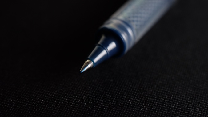
Alongside the Ohto Fude Ball 1.5, I really wanted to try out another rollerball style pen, as I usually don’t write with one as much as I used to. Ever since my Morning Glory Mach 3 ran out of ink, I’ve been hesitant to get another rollerball. While I can appreciate the feeling of the ball gliding across the page, it just didn’t give me a sense of feedback at all.

IMG-0207

I have slowly noticed an actual change in my tastes for what I look for in a writing experience and it is something that struck me as surprising. For the longest time, I was all about the smoothness of the nib and as minimal feedback as possible, but now, I find myself desiring a little feedback and finding some sort of appreciation for what it brings to my writing experience. Maybe I can chalk this up to my character maturing and being able to appreciate different things instead of restricting myself. Only time will tel I guess. Anyway, back to the review

IMG-0215

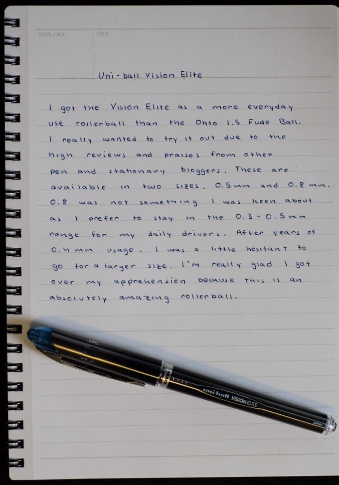
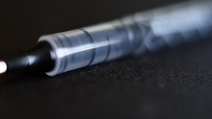
Needless to say when I first wrote with the Vision Elite, my conceptions on how a rollerball is “supposed” to feel were thrown out the window. Due to using the Uni-ball Signo for the longest time, I’ve gotten used to the slightly scratchy but pleasant sensation of writing with it. It gave me a perceived sense of precision and consistency that the Morning Glory simply couldn’t because of the way it would sometimes deposit extra ink onto the page causing variations in line width. The Vision Elite seems to be a strong middle ground in between the two. Smooth enough at varying angles due to the rollerball and having just the right amount of feedback that almost made me mistake it for a gel pen.

IMG-0209

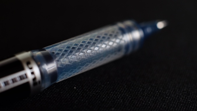
The grip section is very well designed and the diamond-shaped groove pattern provides a decent amount of purchase while not cutting into you fingers. Initially, I had problems adjusting to how thin the section was in relation to the rest of the pen and my extra string grip led me to feel uncomfortable and my hand started cramping. It took a couple of days to really find the right grip strength and placement that allowed me to comfortably use the Vision Elite. Once I found that specific combination, my writing experience improved by leaps and bounds.

IMG-0212

While I haven’t been able to test it, the pen is supposed to be airplane safe with a “protective reservoir inside the barrel that prevents air from expanding in the ink tube” (excerpt from JetPens description). Since I’m taking a couple of summer courses, I won’t be able to test this out until late July, but when I do, I’ll definitely come back and update the review with my thoughts.

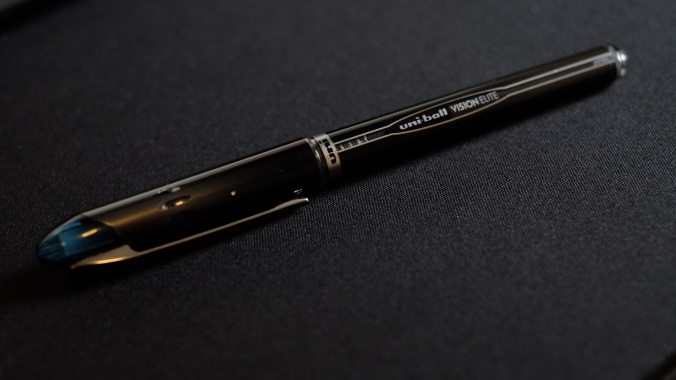
I’m very happy with my decision to get the Uni-ball Vision Elite as it is a pen that provides a great middle road to choosing between a gel pen and a rollerball. The consistency of the line as well as the ink make a great pairing and absolutely catapults this pen to the top of my Top 5 Rollerball Pens list. The Vision Elite has very quickly grown to be my most reached for pen when it comes to both note-taking and writing in general. I highly recommend this to everyone who likes using gel pens or rollerballs as the Vision Elite allows you to experience the best of both worlds.


P. S. I know I’ve been releasing a little slowly, schoolwork is ramping up and I’ve been inundated with numerous projects to keep track of and exams to study for. I’m in the final stretch, so I’m almost done. Expect maybe one more review tomorrow to cover for the first half of April, but after that, I won’t be able to post until the semester ends on May 4. I’ll take a week break to rest up and refocus for summer, then I’ll post 2 reviews for the second half of April and the first half of May. Thanks so much for your patience and support guys, it really means a lot to me. Wish me luck for finals! 🙂


Ohto Fude Ball 1.5

DSCF1643

I really wanted to try a more unique pen as I was getting bored with the standard 0.4mm and 0.7mm rollerballs that I have reviewed in the past. I saw the Ohto Fude Ball 1.5 in my recommended list of products when I was purchasing some notebooks and pens to review on JetPens. It struck me as slightly odd due to how big the line width was. Usually, the size of 1.5mm is something I’ve only experienced on my Lamy Safari with the 1.5 calligraphy nib. Having that same size in rollerball was something that sounded really odd and not my taste, but sometimes, to find something you like, you need to first get out of your comfort zone.

DSCF1649

I can say with certainty that this was a hit and miss for me. I tend to write a little on the smaller side, which has been a characteristic of my writing since childhood. This pen forced me to write larger than I was comfortable with and hence, my letters were all out of sorts and crooked as can be seen in the written review above. There was no grip on the pen which made it very easily shift around my hand, causing the line width to vary sometimes from letter to letter. It took me a while to get a solid straight grip that didn’t vary in angle, but it was difficult to maintain for a long writing session. The ink was a little finicky and feathered on most of the papers I had which made it difficult to take notes in class.

DSCF1652

Some of the positives that come with the rollerball being this wide is the amount of pressure you have to put when writing is nearly negligible and the pen can easily slide across the page without effort. The problem with this is that it makes it difficult to keep a steady angle of writing. The pen itself is really lightweight and slightly translucent so you can keep track of how much ink is left. With a 1.5mm line width, I’d expect the level will go down quite quickly.

DSCF1653.JPG

Overall, I wasn’t very impressed with the Ohto Fude Ball 1.5. Maybe it’s just not my cup of tea, but I’m honestly happy I tried something different. The monotony of reviewing pens with the same characteristics can really get to you, so it was nice to switch things up for once. Although it didn’t work out for me, if you’re looking for an extra wide rollerball with a lot of line variation, this is one pen you can definitely give a try.

Diamine Grape Review

DSCF0217

Purple is not a typical ink color I use due to it being a little out there. However, after a rather amazing experience with Iroshizuku Yama-Budo, I started to see how I could use purple as more of a color for personal stuff. I like to keep a bullet journal going, so I first started to use this ink as a specific color for tracking my tasks for the day. That was almost 2 months ago and I’m still using it to this day. In fact, the 30 mL bottle I had is almost finished and I’m contemplating getting more. I don’t know whether I want to make this a permanent member of the rotation given that Diamine and other brands all have offerings in a similar shade. Personally, by not making something permanent, I can go and get a variety of inks that I’ll be able to review and I might find some other ink that becomes a new favorite. I’m honestly a little stuck regarding this.

DSCF0225

However, you guys came here to learn about how this ink handles, so I’ll get back to the review. The ink is on the darker side of purple, which appeals to me a lot as I can see it being something that fits in with all the other inks I have. The shading is really nice but on the medium side due to how dark the ink already is. I found that you can’t see much difference between the second and third passes as it’s too dark to really tell. It can be exaggerated through the use of a folded pen, like I did in the first photo, but its limited. It’s pretty smooth flowing and the performance is up to Diamine standards, so it behaves well in every different pen I’ve tried it with.

One complaint I have with it is that it feels a little dry when in use. Don’t get me wrong, it flows smoothly, but the actual ink itself makes me feel more feedback when writing. I tried it out in the TWSBI ECO, Lamy 2000, Platinum Preppy and others, but the same feeling of dryness persisted. An example of an ink that doesn’t have this problem would be Iroshizuku Yama-Budo, it has a bit of a slick feeling to it, allowing a smoothed nib to glide across the page. With Grape, it lacks that same feeling, but at the price point that Diamine offers it at, it performs pretty well. If you’re looking for a dark purple with subtle shading at an affordable price, this is a great contender.


Kyokuto Guildford Notebook

DSCF9067

Whenever I find myself in need of notebooks, it’s usually mainly for note-taking and assignments. I found my best notebook ages ago when I first got a 5 pack of Maruman Mnemosyne B5 notebooks from JetPens. Writing with those notebooks was a cathartic experience and no other notebook has ever given me the same feeling whenever I write. To me, the Maruman Mnemosyne line has become the bar I set whenever I write paper reviews. With that in mind, I felt that the blog was really lacking some paper reviews and decided that I needed to try out some new products. So as I was shopping for my spring quarter in early 2016, I stumbled upon the Kyokuto Guildford on JetPens. HAving never heard of this notebook before, I was curious and decided to do some research on it. As it turns out, there weren’t too many reviews from the mainstream stationary blogs I follow, so I decided to get it and put out a review myself.

DSCF9069

The notebook has a very simple design, yet within that simplicity is the sophistication as seen through the ornately embellished patterns that decorate the index page. The color scheme of the notebook is tasteful and bright.

DSCF9070

In regards to the paper, I have to say for such thin paper, I wasn’t expecting it to be so resilient against some pretty wet inks. I used many different inks in this notebook before I wrote this review and the paper withstood all of them, all while providing a smooth writing experience. This particular review was written with a Lamy 2000 M nib inked with Iroshizuku Shin-Kai. The paper simply soaks it up, resulting in quick dry times. This holds true for even inks with longer dry times like Sailor Kiwa-Guro Nano Black. With all the inks, I also noticed that none of them feathered regardless of the nib size of the pen. All of these make the Guildford a solid choice for someone who requires a decent notebook for simple note taking and the like. However, there were some drawbacks that came with these positive aspects. Due to being thin, the paper has a tendency to be affected by the indentations on the opposite side. Ever since picking up pointed pen calligraphy, my writing pressure has gone down significantly, yet it still cause indents on this paper. Along with the indents, come the ghosting and with some inks like J. Herbin emerald of Chivor, it really posed a problem. One reason I simply could not use the Guildford for school more often was the lack of pages and perforation. I usually end up writing about 4-6 pages of notes every day I’m in class. I take a lot of technical courses that require notes to be numerous and comprehensive for future studying. With only 38 sheets, the Guildford would not be able to accommodate the amount of notes I take. Even when I use front and back, with 32 lines of 6mm per page, the notebook would still last less than a month of classes. Also, the lack of perforation means I can never do assignments on this paper and turn it in, as it would both look like and leave a mess.

DSCF9074

The binding is sturdy and does a great job of securing the pages within the notebook. This would be the one thing that I would admit that the Mnemosyne line can improve on. When turned all the way, the cover of the Mnemosyne tends to come loose of the binding and it’s a bit of a pain to realign it again every time. This binding has never failed me even once and is very resistant to bending, unlike the plastic ones present on the Mnemosyne notebooks.

With a tasteful color scheme and classy motifs, the Kyokuto Guildford is a functional and stylish notebook that can take on just about anything you throw at it. The thin paper saves on space and allows the notebook to have a compact form, while the durable covers protect them from wear and tear. The binding is strong and resistant to bending ensuring that you notebook will keep its shape and the pages inside will be protected. While it might not be ideal for doing assignments in with its lack of perforation, it still holds its own against other notebooks out there. I recommend everyone give this notebook a try.

Sailor Souten Review

So sorry for not being active for the last month almost. After Spring Break, the amount of work I had to finish went up drastically and there’s still lots more to come. I just finished my exam week and only have a month to prepare for finals. This weekend is a small respite, as I finally had time to sit down and finish a couple of reviews. This will be number 1 of 3, to make up for the end of February. The second and third will come tomorrow, officially finishing the quota for March. I don’t know if I’ll be able to put any out until after the semester’s over in May, but I’ll try my best to keep you guys updated. Please follow me on social media for quick updates. You can follow me through the buttons on the right for Twitter and Facebook, and my Instagram feed gallery is linked to my profile.

DSCF9034As you all may know after all this time. I love me some blue inks. Any shade, any brand. You name it, I’m willing to give it a try. I’ve had this ink for almost 2 years now. The ink is almost finished, so I knew I needed to get a review in before it ran out.

DSCF9037By the time I got onto the Sailor bandwagon, I found that some of the inks I really wanted to try had officially been discontinued. I could no longer find Grenade, Epinard and Sky Blue. I was immensely disappointed at not getting the chance to review them, but perked up when Sailor announced that they would be revealing a new Four Seasons ink line that would be the future of Sailor inks. Excited, I waited with bated breath for the Los Angeles International Pen Show to get my hands on some. When I reached, I went straight over to the Anderson Pens booth and got this bottle of Sailor Souten (Azure Sky), the touted successor of the Sky High. I have to say, I was not disappointed at all with my purchase.

DSCF9043The performance of Souten is about as expected of any Sailor ink. It behaves well in every pen I ink it up in and shades differently based on the nib size and any special characteristics. While I wrote the review with my Lamy Safari M, I usually used it with my TWSBI 580 Pendleton BLS grind fountain pen. The unique grind on the nib allowed for the shading to really show through.

DSCF9039The ink also has a beautiful red sheen when used in a broad or wide italic nib. The red is concentrated around where the ink typically pools inside the letters. However, if you’re using this ink with a fine or extra fine nib, don’t expect any real shading or sheen to show when writing.

DSCF9046Now for the Sailor performance, you’re going to be paying a rather premium price. This ink typically retails for around $18 at Anderson Pens and other similar retailers, I’ve seen it go for $14.25 on JetPens, which is by far the cheapest I could find it going for. If the price doesn’t bother you, then this is a solid, well-behaved blue that will perform well in any pen you use it in. I recommend this to anyone who likes Sailor inks and wants a nice blue to add to their collection.


Horizon Folded Pen

Sorry for not being as active as I would have liked. I’ve taken a rather intense course load for the semester and tests keep barreling towards me like trains and I have to do my best to study as hard as possible. I’ve had next to no free time in between studying and I’m ending up still awake at 2 in the morning doing calligraphy drills to calm down before heading to sleep. It’s nearing midterms week so, there’s going to be more and more thrown at me right before that time, so this might be the only update for the next two weeks (hopefully not). Thank you all for your outstanding patience and I will endeavor to get another review in today if possible.

dscf8102

This was a nib that I really wanted to get my hands on for the longest time. So when I finally did, I went absolutely nuts with experimenting. Different inks, angles of the strokes going for the splatter pattern I see so many of my favorite calligraphers make when they use it. So far, I have not been able to get it yet, maybe it’s all in the flick of the wrist as the letter ends.

A folded nib is a rather unique nib when it comes to calligraphy as the style of writing is very different from say, a broad edge pen. It’s relatively new innovation in the calligraphy industry and it definitely has a unique charm that other current nibs can’t provide.

The center fold of the nib acts as the ink reservoir and it can really hold a lot of ink. I did a full dip and was able to write 3 capital letters before running out. As it’s running out, if the ink has nice shading, like Iroshizuku Yama-Budo, then the color will start getting progressively lighter with each stroke allowing you to view numerous gradations as you write. Depending on the angle you hold the nib relative to the paper, the stroke could be thin or brush-like. Also, how much control you exert over the nib changes the way the ink flows, as heavy pressure from the hand, results in more ink on the page. Pacing is also important, as a fast pace can result in choppy lines. All of these variations can be seen in the first picture.

dscf8117

You can choose to either buy one or make one. I chose to but from Paper Ink Arts as I tried making one and it just didn’t come out right no matter how many times I tried, so I defaulted to buying one. There are instructions to make one too though they typically won’t be as consistent as a store-bought one. The end result, however, is similar so if you just want to try it out to see the possibilities, you can just make one and experiment with it.


J . Herbin 1670 Emerald of Chivor

This was an ink review in the waiting for the last few months. I’ve been meaning to get around to it for a long time, but it just never happened with how hectic my schedule was. After a lot of delays, I finally decided that the first review of the summer, will be this. Without further ado, let us jump right in to my review of J. Herbin’s Emerald of Chivor.

The box it came in was very nicely detailed and shone exquisitely when it reflected the sun. The drawing was absolutely mesmerizing and a very nice touch to a somewhat luxurious product. Initially, I was very reluctant to spend $26 on a bottle of ink, but I bought my ticket and boarded the hype train. Looking back, I have no idea why it took me so long. Everything about this ink drove me absolutely crazy for it since my first use in my FC Model 40P. It retains all the great characteristics of a standard Herbin ink while adding an extra component that makes this ink shine(pun intended 😉 ). I also love using it in my Pilot Parallel pens because the ink just exhibits its characteristics much more beautifully when it’s used with a juicy, 6.0mm nib.

The one thing that makes a hype train possible is a unique characteristic that you can’t find anywhere else. For the J. Herbin 1670 inks, it’s the gold flakes that allow for some sparkly handwriting that glitters in the light. Seeing its commercial success, Diamine jumped aboard the gold flakes hype train, but failed to recreate the Herbin experience (more on that later). The beautiful teal color of the ink meshes really well with the gold and creates a stunning contrast that’s very pleasing to the eyes. My only gripe is that it is pretty expensive, making me hesitant to use it more liberally than I usually would. Other than that, I highly recommend it to anyone looking for a change in their usual ink or those who love sparkly inks.

Pilot Frixion Point 4

DSCF7908

Now this is a pen that I personally found to be much more comfortable than the slim version I reviewed a while ago. The body is larger than the slim (go figure), but this change in the size and width make it that much more easy to write with.

DSCF7912

The cap is a welcome addition as it is much better than the knock archaism on the slim. It caps nicely with a resounding click and is not going to accidentally pop off any time soon.

DSCF7919

The grip is a little thin, but it surprisingly makes up for it by being made of a slightly squishier material than the standard plastic grips I’ve gotten used to. It reminds me of the Alpha-gel pencils that were extremely popular in high school. Though not as squishy as that, it definitely does a decent job in helping keep stress off my fingers when I grip slightly harder than usual. With the stress I’ve been under studying for finals, I’ve noticed that I’ve been squeezing harder than usual.

DSCF7918

The ink is the same as the last Frixion, a thermo-sensitive ink that can be erased through the power of… you guessed it: friction. One of the things I’ve noticed after lurking on many a pen store scouring the various reviews is the possibility of getting a bunch of lemons in a pack. People were complaining about how after a few sentences or after a couple of weeks, the Frixion dried out quickly. One trick to reactivate the ink would be to put it in the freezer as recommended by JetPens. Now I personally have yet to face this issue with either of my Frixions so I cannot make any conclusions as to the validity of these claims, but I figured I should mention it, just in case any of you were looking into picking one up.

DSCF7914

The eraser boasts the same efficiency of the slim and I have yet to find any difference in the erasing ability of either. While I can’t confidently claim that all the Frixion erasers have the same level of reliability, I can infer that based on my experience with these two, the standard should be about the same across the board. JetPens created an amazingly detailed comprehensive guide to the Frixions that you can check out when making your decision.

The Frixion Point 4, as this particular model is called, is a great pen that completely bows the Slim Ball out of the water in terms of comfort. The erasable ink allows it to be used in any setting whether for personal or office related tasks. The ink erases without a fuss and the pen is well-designed. While a little more on the expensive side, the convenience of being able to erase while using a pen makes the cost worthwhile for me at least. If you’re interested in pen with erasable ink, look no further than the Pilot Frixion series.


Pilot Mutli Ball Rollerball

100th post! Yay! New milestone. Onwards to 250. 🙂

DSCF7898

I was recommended the Pilot Multi Ball Liquid Ink pen by a friend and I simply got it just to give it a try. Little did I know, I would find such as amazing pen in the process. The Multi Ball is a liquid ink rollerball pen that has a fine tip. The writing experience is reminiscent of the Retro 51 but it has one very important difference, the size of the tip is absolutely perfect for me. The grip, while a little thin, is well designed with small circular indents to helps when I choke up my grip to try to gain maximum control. I tend to post most of my pens, but on the Multi Ball, the clip tended to dig in to my hand, so I just decided to not post. This was fine as the long body of the pen allowed for comfortable use without needing to post. Overall, I’m very happy with my decision to try this pen out. Go try the Pilot Multi Ball out and you’ll be surprised by the way it handles in comparison to the Retro 51 and for those looking for a thinner rollerball, give this a try.

Diamine Sherwood Green

DSCF7892

Sherwood Green has quickly become one of my favorite green inks and for good reason. Rich and saturated with a color tone resembling that of a dark forest. On thinner nibs, I noticed that there was a huge variety of shading. When I was testing it out in my Platinum Nice Pur fine, I noticed a chromatic effect when observing the tops of the line going from a light to progressively darker color at the bottom where the ink seemed to pool when the nib pulled off the paper. It has really helped me open up to the wide array of green inks I never thought I’d try. It allowed me to take a small step outside my comfort zone and traditional color palette of blacks and blues when it came to my inks. I can’t wait to try many more offerings from Diamine as well as the numerous other companies. If they’re anything like Sherwood Green, I know I’ll love them.