Ohto Fude Ball 1.5

DSCF1643

I really wanted to try a more unique pen as I was getting bored with the standard 0.4mm and 0.7mm rollerballs that I have reviewed in the past. I saw the Ohto Fude Ball 1.5 in my recommended list of products when I was purchasing some notebooks and pens to review on JetPens. It struck me as slightly odd due to how big the line width was. Usually, the size of 1.5mm is something I’ve only experienced on my Lamy Safari with the 1.5 calligraphy nib. Having that same size in rollerball was something that sounded really odd and not my taste, but sometimes, to find something you like, you need to first get out of your comfort zone.

DSCF1649

I can say with certainty that this was a hit and miss for me. I tend to write a little on the smaller side, which has been a characteristic of my writing since childhood. This pen forced me to write larger than I was comfortable with and hence, my letters were all out of sorts and crooked as can be seen in the written review above. There was no grip on the pen which made it very easily shift around my hand, causing the line width to vary sometimes from letter to letter. It took me a while to get a solid straight grip that didn’t vary in angle, but it was difficult to maintain for a long writing session. The ink was a little finicky and feathered on most of the papers I had which made it difficult to take notes in class.

DSCF1652

Some of the positives that come with the rollerball being this wide is the amount of pressure you have to put when writing is nearly negligible and the pen can easily slide across the page without effort. The problem with this is that it makes it difficult to keep a steady angle of writing. The pen itself is really lightweight and slightly translucent so you can keep track of how much ink is left. With a 1.5mm line width, I’d expect the level will go down quite quickly.

DSCF1653.JPG

Overall, I wasn’t very impressed with the Ohto Fude Ball 1.5. Maybe it’s just not my cup of tea, but I’m honestly happy I tried something different. The monotony of reviewing pens with the same characteristics can really get to you, so it was nice to switch things up for once. Although it didn’t work out for me, if you’re looking for an extra wide rollerball with a lot of line variation, this is one pen you can definitely give a try.

J. Herbin Bleu Nuit

DSCF1633

It took some real effort for me to decide to switch up my daily driver ink for another. Usually, I make sure to keep a stable pen that I know I can depend on with an ink that I can trust to not mess up when I’m using an ink I’m going to review in the future. I’ve had bad experiences before with missing an entire class worth of notes because the ink I was testing didn’t properly go with the paper I was using and started to bleed through. After a couple of those experiences, I made sure to always have a backup ready just in case. This semester, I didn’t take as many fountain pens to Indiana, because I wanted to stick to the bare minimum because cleaning can become a hassle. I stuck to my trusty Lamy 2000 and TWSBI ECO. For the entirety of the last semester, I had the Lamy inked up with Iroshizuku Shin-Kai, which quickly became a daily driver of mine and I’m almost finished with the bottle. I needed to review Bleu Nuit, but my TWSBI was already inked up with Bleu Pervenche. So I decided that I needed to switch things up a little bit.

DSCF1635

Bleu Nuit is an interesting ink, because of the way it looks straight out of the bottle. Honestly, I was initially skeptical of the color because I saw both the grip of my pen and my hand being stained with a purplish blue color and thought that maybe this was going to be reminiscent of Diamine Midnight. However, once I actually used it, it turned out to be a true neutral blue-black ink. Directly from the nib, it holds a purplish color, but dries to become blue-black with hints of grey undertones. Unlike Diamine Midnight, which acted the opposite way and caused me to dislike the end result.

DSCF1636

It has all the characteristics that one would expect of a J. Herbin ink. It’s lubricated, well-behaved and there is a decent amount of shading. This was especially accentuated through my use of a slightly wet medium Lamy nib. I’m sure the shading would be turned down if used in a fine or extra-fine, so that’s something to keep in mind if shading is something you look for. As I mentioned above, the color you see in the ink bottle and directly from the nib can confuse you, but be assured that it dries to a neutral blue-black. I honestly enjoyed watching it drying as it looks similar to how Shin-Kai looks when it has dried.

DSCF1641

One thing that might be a bit of a drawback with this ink is, as always with J. Herbin, a little bit on the expensive side. The 10mL can be bought for $5.50 on JetPens (not sponsored) and the 30mL can be bought for $12.00 from all your favorite pen shops. On the other hand, Diamine Blue-Black, another great blue-black ink, is priced at $7.50 for 30mL. My advice would be to get the 10mL to test it out and decide if you like it before purchasing any larger sizes.

Maruman 3Feet Notepad – A7

DSCF1599

This was a little bit of an impulse buy because I had run out of Field Notes and didn’t want to buy another pack as I found myself using them less frequently now that I had gotten my hands on the legendary Hobonichi Techo planner(review coming soon 😉 ). At the same time, I needed a small notebook to quickly jot down some notes occasionally if I think of something interesting. Enter the Maruman 3Feet, an A7-sized, 7mm grid ruled notepad with some great features that I found really made using it fun.

DSCF1601

This is one feature that I really feel changes the game when it comes to comfort when using a Rhodia style notepad. With the Rhodia, the front cover has notches the help it bend exactly the way to it needs to lie flat, but if not used on a relatively flat surface, it starts to flop around. Maruman fixed this problem by adding a small tab at the back of the notebook that allows you to tuck the front cover into it and holds it securely in place. Now this may not seem like a big deal for most people, but as someone who is usually walking, pacing or generally standing up when my ideas come, the ability to quickly jot down stuff while on the move is important to me and a cover that doesn’t flop around makes writing stuff down easier for me. Now most of you might not be like me, but if you ever want to move around with a Rhodia, due to not being secure, you can’t just lift it by the front and you have to mind the cover coming back around. With the Maruman, moving around is super easy and you don’t have to worry about the cover coming down on your freshly inked page and ruining your writing (If you couldn’t tell by now, this has happened to me several times and I am always annoyed by it).

DSCF1606

With that amazing, highly functional and useful feature properly getting the praise it deserves, let’s talk about the paper. Being an A7 sized notebook, I was initially a little surprised that Maruman didn’t opt for a 5mm grid because it would allow for more lines, but eventually saw why they stuck to 7mm. As someone who’s handwriting is pretty small, I was a little bothered by how big the squares were, but grew to appreciate them when it came to creating flashcards, which is now the main usage of this notebook. To understand some concepts and terms, I find that having a physical flashcards really helps with memorization as it involves writing down the terms, thereby increasing muscle memory.

DSCF1626.JPG

The paper is also very smooth when tearing. I am not prone to hyperbole, but this is by far the greatest perforation I have ever experienced. The paper comes out smoothly and without a fuss every single time. I often experience ragged tears when dealing with smaller Rhodia DotPads and it drives me nuts due to my OCD when it comes to having straight, even tear lines. After nearly 3 weeks of usage, not a single time have I ever experienced a misguided tear. I’m pretty much addicted to this feeling now and will hold this as the benchmark for all future perforated notebooks I review.

DSCF1613

The biggest drawback to this notepad is the paper, specifically how thin it is. While it took ink well and for the most part didn’t bleed through, there was a rather noticeable amount of show-through on the backside of the page. This was something that I feel can’t be helped as the size of the notepad constrains how thick the paper can be, but by far, it turned out to be my first negative experience with Maruman paper.

DSCF1619

One of the other things that I found out very quickly was the 3Feet reacts badly to sharper, thinner sizes of pen tips. The Uni Jetstream that I used for the paper test ended up scratching through and indenting nearly 4 sheets of paper, so I would recommend only using pens that have tip sizes of 0.5 and above. At those sizes, the paper will perform just fine.

The Maruman 3Feet is an adorable little notepad with a great feature that I hope more notepad makers will adopt. The paper is thin, yet surprisingly adept at handling larger nib sizes. The main drawbacks would be the limitations with sharp tipped gel pens and the show-through on the back of the paper. If these two things don’t bother you as much and you’re in the market for a pocket-sized notepad, give the Maruman 3Feet a try. For a mere $2.10, I feel it’s definitely worth the price.

J. Herbin Bleu Pervenche

DSCF1586

I’ve had this ink for a long time and just got around to writing a review now. I saw that J. Herbin was selling tiny bottles of ink for very affordable prices and couldn’t resist getting some. When it comes to reviewing, one thing I have to worry about is the cost of the inks. I have to constantly decide whether a whole bottle of ink is worth it and if I’ll even be able to use all of it. I really like using the ink for at least a minimum of 2 weeks mainly for writing notes. With the amount of notes I write, an ink sample is not enough at all to experience and then review.  That’s mainly why the tiny bottles of J. Herbin were perfect to get a good amount of writing done and not break the bank.

That being said, it is a little inconvenient to fill up a pen with a bottle this tiny. The opening is barely enough for the Lamy 2000 and only smaller pens would be more easy to fill up. The TWSBI Eco was pretty easy to fill, but I’m predicting it won’t be as easy once the level of ink goes below a certain point. Then it will be an interesting experiment to find an efficient way to fill up my pens without creating a mess.

DSCF1592

One thing that really appealed to me right off the bat was the vibrancy of the color. When filled up inside a demonstrator pen like the Eco, the ink looks much darker and its a surprise when the nib touches the paper and a bright blue is all you see. I used this ink in multiple pens from the TWSBI Vac Mini, Lamy 2000 and the Pilot Custom 823 and it was well-behaved in all of them, as I’ve come to expect from J. Herbin inks in general. The ink is decently lubricated and flowed well out of all the pens I tested it in. When writing with some different nibs, I noticed that there was good shading from an EF to M nib and while it may not be apparent from the photo, the sheen on the ink is slightly red in places where it pools. It might be my eyes playing tricks, but I also see hints of green too. It’s a pretty looking ink that any lover of light blue inks would like.

DSCF1595

While Bleu Pervenche has all those great characteristics, it also has some drawbacks. The one I experienced the most frequently was feathering. This ink is very finicky on the type of paper you use it with and the only type that worked perfectly for me was Rhodia. Even the Maruman Mnemosyne notebooks which I absolutely love and are tanks when it comes to inks, showed signs of feathering when I wrote notes. This was most prevalent when I adjusted the amount of ink due to some skipping with the TWSBI. With that, the dry times I experienced were north of 15 seconds on Maruman paper, which became a huge hassle as I had to wait for the ink to dry before turning the page to continue taking notes. I had made the mistake of not waiting a couple of times in a rush and the back of the notebook got stained and the letters got obscured.

DSCF1596

Overall, Bleu Pervenche is a very well-behaved light blue ink that has decent lubrication and great shading. It works really well with Rhodia paper, but if you don’t mind some feathering, most other notebook brands like Maruman and Kokuyo will work fine. Depending on the nib you use, your dry time may differ, but I would recommend for those using M nibs and above be aware of the slightly longer dry times and compensate for them accordingly. Other than that, I recommend picking up a small bottle of J. Herbin’s Bleu Pervenche to try out.

Caran d’Ache Technalo Pencil

dscf8137

This is my first foray into Caran d’ache pencils and I’m very satisfied with my experience so far. The Technalo was something that I inadvertently picked up because I wanted to try some Caran d’Ache pencils and this one seemed pretty unique and different from the ones I’ve reviewed so far. I was curious to see how the water-soluble graphite would feel when writing. I wasn’t expecting Blackwing 602 performance, but the lead was soft enough to rival it.

dscf8142

The pen is marketed as a water-soluble graphite pencil. This means that the typical use of this pen would be for watercolor-esque washed and you would see the graphite getting lighter with multiple washes. I have not gotten to test this yet as I lack the proper paper that is able to take a wash or two. Hopefully once I get some watercolor paper I can truly make use of this pencil. Until then, just writing with it will suffice.

dscf8144

The matte finishing on the body is one of the things that was the biggest gripe I had about this pen. Due to the smoothness, it was extremely difficult for me, someone with sweaty hands, to get a proper grip when I was writing. I ended up forming a death grip near the front of the pen but still struggled to maintain a proper hold.

dscf8145

There was a lot of rather ostentatious branding as well as unnecessary applications of shiny material. Unlike some of the more subtly branded and understated pencils I’ve reviewed in the past, the Technalo goes out of its way to seem luxurious. However, I have to say that it does look really good even if it’s not to my specific taste.

dscf8147

The lead was very soft and honestly felt much like a colored pencil. The death grip I was slowly developing lea to me putting a lot of pressure when writing and I could feel the lead depressing when I pushed. It led to one side being soft and wider and when I switched sides, it started out extremely sharp and resulted in a darker line. You can see in stances of this phenomenon in the first picture.

Horizon Folded Pen

Sorry for not being as active as I would have liked. I’ve taken a rather intense course load for the semester and tests keep barreling towards me like trains and I have to do my best to study as hard as possible. I’ve had next to no free time in between studying and I’m ending up still awake at 2 in the morning doing calligraphy drills to calm down before heading to sleep. It’s nearing midterms week so, there’s going to be more and more thrown at me right before that time, so this might be the only update for the next two weeks (hopefully not). Thank you all for your outstanding patience and I will endeavor to get another review in today if possible.

dscf8102

This was a nib that I really wanted to get my hands on for the longest time. So when I finally did, I went absolutely nuts with experimenting. Different inks, angles of the strokes going for the splatter pattern I see so many of my favorite calligraphers make when they use it. So far, I have not been able to get it yet, maybe it’s all in the flick of the wrist as the letter ends.

A folded nib is a rather unique nib when it comes to calligraphy as the style of writing is very different from say, a broad edge pen. It’s relatively new innovation in the calligraphy industry and it definitely has a unique charm that other current nibs can’t provide.

The center fold of the nib acts as the ink reservoir and it can really hold a lot of ink. I did a full dip and was able to write 3 capital letters before running out. As it’s running out, if the ink has nice shading, like Iroshizuku Yama-Budo, then the color will start getting progressively lighter with each stroke allowing you to view numerous gradations as you write. Depending on the angle you hold the nib relative to the paper, the stroke could be thin or brush-like. Also, how much control you exert over the nib changes the way the ink flows, as heavy pressure from the hand, results in more ink on the page. Pacing is also important, as a fast pace can result in choppy lines. All of these variations can be seen in the first picture.

dscf8117

You can choose to either buy one or make one. I chose to but from Paper Ink Arts as I tried making one and it just didn’t come out right no matter how many times I tried, so I defaulted to buying one. There are instructions to make one too though they typically won’t be as consistent as a store-bought one. The end result, however, is similar so if you just want to try it out to see the possibilities, you can just make one and experiment with it.


Diamine Sherwood Green

DSCF7892

Sherwood Green has quickly become one of my favorite green inks and for good reason. Rich and saturated with a color tone resembling that of a dark forest. On thinner nibs, I noticed that there was a huge variety of shading. When I was testing it out in my Platinum Nice Pur fine, I noticed a chromatic effect when observing the tops of the line going from a light to progressively darker color at the bottom where the ink seemed to pool when the nib pulled off the paper. It has really helped me open up to the wide array of green inks I never thought I’d try. It allowed me to take a small step outside my comfort zone and traditional color palette of blacks and blues when it came to my inks. I can’t wait to try many more offerings from Diamine as well as the numerous other companies. If they’re anything like Sherwood Green, I know I’ll love them.


Maruman Mnemosyne Notebook

Hands down the best paper I’ve ever used! To me, Maruman Mnemosyne paper is the gold standard of fountain pen friendly paper. It is the paper that I use for almost all my schoolwork, whether it be note-taking, homework, writing assignments, etc.

DSCF7012

The Maruman Mnemosyne I use is sized at B5, measured at 7.4 by 9.9 inches with 7mm line rulings. The binding is a double ring, ensuring a smooth flip as well as being able to take a beating (the stories I could tell you…). At the top there are sections for Date/No. and a Title. The lines are all a cool grey making the rulings very subtle and less distracting during use. There are 80 pages that are micro-perforated, allowing for easy tearing. All the pages are acid-free, meaning they won’t yellow over time, making it great for storing notes and the like. Each page is split up into 3 different sections of 10 lines each. I found it very helpful as I used those 10 lines as guidelines to keep what I wrote to a minimum that encapsulated the main points of the section.

Why do I love this paper so much? It is the smoothest out of all the papers I’ve ever tried. Nothing I have used short of Tomoe River has been nearly as smooth. With a slightly larger nib, I feel the pen gliding over the paper. My favorite pen to use is my Pilot VP with a medium nib. After it was binderized, it felt smooth no matter what paper I used it on, even copy paper. I feel that the Maruman brings out the best in it, though.

DSCF7013

Another great reason I love Maruman is the absorbency. On Rhodia paper, it takes a little longer for inks to dry allowing for many potential mishaps and accidental swipes occur. Not with the Maruman! While it doesn’t dry instantly (if only), the dry times on the Maruman is noticeably less than on Rhodia.While absorbent, it also is very resistant to ghosting, which made it possible for me to use the other side of the page without any hassle. The absorbency was displayed to me on accident one day when I was fiddling around with my converter. I think I was frustratedly trying to push the ink to the front as the nib was drying up. I twisted a touch to hard and the ink dropped onto the page creating a large blob. Panicking, I desperately tried to spread it out across the page to prevent it from soaking through (yes, it can possibly happen). I spread it out and waited for about a thirty seconds before daring to turn the page. To my great surprise, the ink blob had mostly dried, other than the very center. The other side was also completely usable despite what had happened.

DSCF7020

So I’ve been praising this paper a lot so far, but now I will address one of its less attractive aspects, the price. The price for the Maruman notebook I use is $11.25USD on JetPens. Rhodia, on the other hand, doesn’t offer any of it’s notebooks in the B5 size. So for the sake of comparing prices, I will use two notebooks of the same size: A4. The price for the Maruman Mnemosyne A4 notebook is $15.50USD. The price for a Rhodia Pad No. 18 is $13.75USD. For the same size, you would be paying $1.75USD more. So it all comes down to: Is the premium worth it? I wholeheartedly say yes, it is. The quality and experience provided by the Maruman is significantly better than the Rhodia in my humble opinion. When I’m writing on the Maruman, I feel how absorbent and smooth it is, I see how the ink pops on the page and I feel the quality oozing from the design. What can I say? You get what you pay for in this case. Keep in mind this is simply my opinion. It is up to you to try the Maruman Mnemosyne out and then make your decision on your willingness to pay. It is subjective for everyone, but I have a hunch that many people will feel the same as I do.

As I mentioned in the beginning, this is hands down the best paper I’ve ever used. I honestly can’t believe how long it took me to get around to this review despite using and loving this paper for so long (approximately 2 years now). If I had a choice of using only one kind paper for the rest of my life, this would be it. If you can get over the slight premium over standard Rhodia paper, you’ll find out why me and many others love this offering from Maruman so much. What are you waiting for?

Disclaimer: I am in no way affiliated with JetPens. I used the prices on their site as it was simply where I have gotten my notebooks from since the beginning. At the time, Goulet Pens was not offering Maruman products, something that changed rather recently. So while the prices may differ from store to store, I’m pretty sure the price disparity between Maruman and Rhodia will stay the same.


Platinum #3776 Nice Pur Ltd Edition

DSCF6797When I was at the L. A. Pen show back in February, I was absolutely thrilled to purchase my first pen from Classic Fountain Pens (nibs.com). I was wide awake, unable to sleep, wondering which pen to get. I was still in my developmental stage as a pen addict, so I was looking for a different experience. When I say different, I meant a smaller nib size, as I had gotten too used to my binderized VP medium nib. After my jaw hit the floor when looking at the price tags on the Sailor pens, I looked into offerings from Platinum. At the time, the Nice Pur was the latest edition in the #3776 Century models. It was a variation on the Nice, which was the previous iteration. I was briefly attracted to the Nice, but the rose gold plating made it seem a bit too gaudy for my taste. I just couldn’t bring myself to get a pen with gold hardware.

DSCF6799
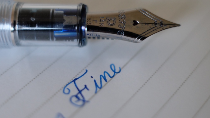
When I was testing the nibs, I was asking advice from John Mottishaw. I told him about my medium VP that I adored, as well as the Franklin-Christoph Masuyama medium CI I had bought that same day. My request was to recommend a nib that gave me an entirely different writing experience from the pens I already had, but was smooth at the same time. He handed me a Platinum fine nib and told me to test it out. I put the pen to the Rhodia pad and it glided across, but provided a decent amount of feedback. I asked to try the medium next, and after a couple of scribbles, decided that it felt too similar to my VP. I narrowed it down to the broad and fine. After mulling it over for nearly 40 minutes, pacing back and forth, I went with the fine. As John was optimizing the pen for me, I was giddy with excitement to test it out and review it. I thanked him for his patience and went on my way.

DSCF6816Fast forward a few months, the Platinum was lying inked up, yet unused in my desk drawer. How did this situation come about? Right after going home, I inked it up and put it into my note taking rotation. I was taking my first class in Spring quarter, and was eager to put this baby to use. I started writing and stopped abruptly. The smoothness had completely gone, leaving it scratchy as a nail. I thought it may have been a problem form the factory, so I went home, rinsed it out, flushed completely, and inked it up again. Same problem, and all the inks I had at the time made this pen seem dry and scratchy. Disappointed, I put it in my desk drawer and forgot about it.

DSCF6829After nearly 7 months of lying in my drawer, I finally spotted it during my pre-Fall quarter stationary inventory. The painful memory of it’s scratchiness surfaced, and it almost went back in. However, in a split second decision, I decided that I had to at least review it for my blog. I uncapped it and tried writing, lo and behold, it worked perfectly without any hard starts. The Slip and Seal mechanism that Platinum heavily advertises as one of this pen’s features really isn’t just marketing hype. After 7 months, it worked the moment the nib touched the paper.

DSCF6813
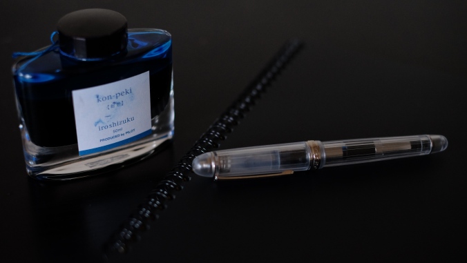
Any bad experience I had with this pen had to be let go, to be able to review it and form an unbiased opinion. So I flushed it and inked it up with a new ink I had bought, Sailor Souten. When trying it out again, I was reminded of the buttery smooth dream nib I had tested way back when. Mystified, I tested it with my standard Iroshizuku Kon-Peki, resulting in it being smoother than the Souten. It was at that moment I realized how stupid I had been. The performance of a pen can be affected depending on the ink inside. I had completely forgotten about this, which resulted in me ignoring one of the best pens I’ve ever purchased.

DSCF6814I was never one for demonstrators, as I felt they looked cheap due to the plastic. The aesthetic of this pen completely rejects that supposition. The striated frosted plastic looks absolutely gorgeous. My only complaint is that the lines tend to dig into my skin when I try to twist the cap on and off. Other than that, it’s one of the best looking pens I’ve had the pleasure of using.

DSCF6809

The first 2000 pens are engraved with a number, as you can see above. Mine is #1597. The engraving is very minimal and I didn’t even notice it until I checked. It’s also very hard to capture a photo of it, as the slightest amount of glare tends to reflect off the top.

DSCF6801

No matter how hard you try to keep the nib free from ink, it’s near impossible. Unless it’s uninked, I have yet to see a Platinum #3776 not have small specks of ink all around the slit. I initially wanted to gripe about it, but realized that it’s not too big of a deal.

DSCF6822

The clip is one of the tightest I’ve ever used. When I’m sliding it into my pencil case, I have to put a bit of effort and bend the clip upwards, otherwise, it’s impossible to force it in. It has kept it’s shape and tightness pretty well over the last month. I feel reassured that it won’t slip regardless of whether you’re wearing it in your shirt/pant pocket, or a pencil case.