J. Herbin Bleu Nuit

DSCF1633

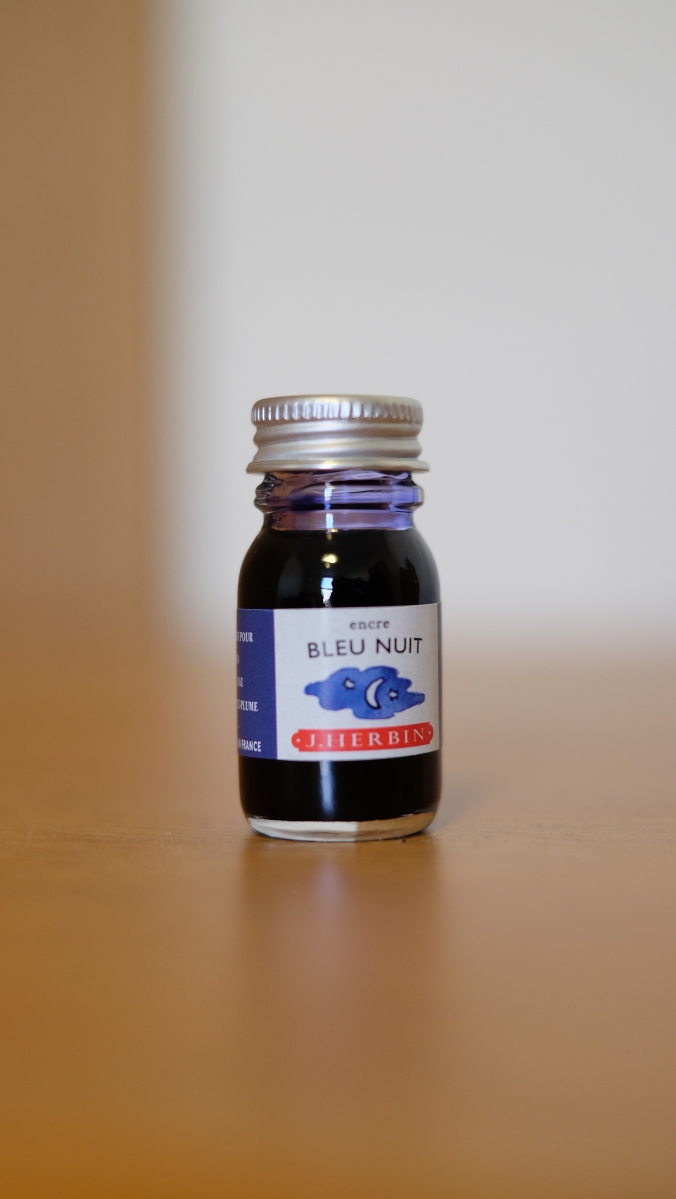
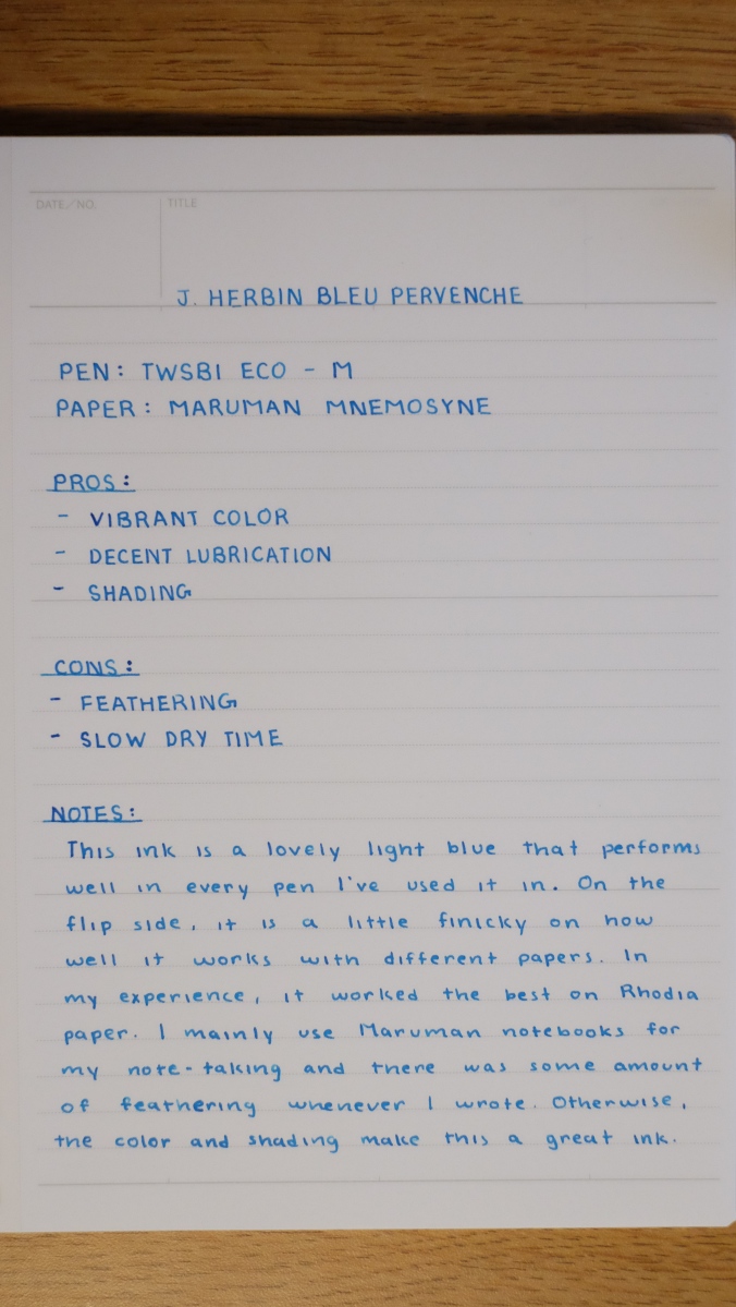
It took some real effort for me to decide to switch up my daily driver ink for another. Usually, I make sure to keep a stable pen that I know I can depend on with an ink that I can trust to not mess up when I’m using an ink I’m going to review in the future. I’ve had bad experiences before with missing an entire class worth of notes because the ink I was testing didn’t properly go with the paper I was using and started to bleed through. After a couple of those experiences, I made sure to always have a backup ready just in case. This semester, I didn’t take as many fountain pens to Indiana, because I wanted to stick to the bare minimum because cleaning can become a hassle. I stuck to my trusty Lamy 2000 and TWSBI ECO. For the entirety of the last semester, I had the Lamy inked up with Iroshizuku Shin-Kai, which quickly became a daily driver of mine and I’m almost finished with the bottle. I needed to review Bleu Nuit, but my TWSBI was already inked up with Bleu Pervenche. So I decided that I needed to switch things up a little bit.

DSCF1635

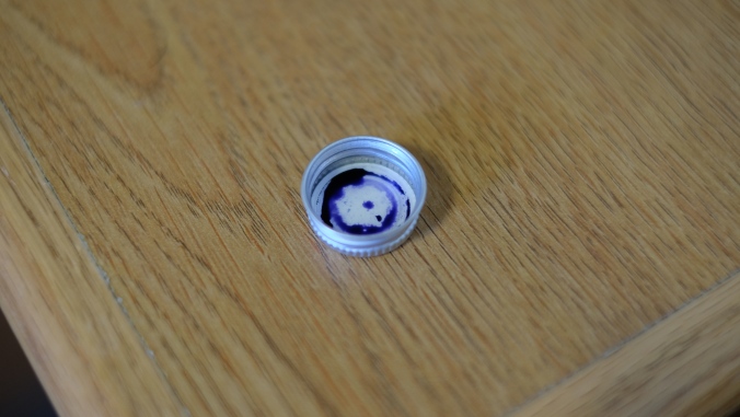
Bleu Nuit is an interesting ink, because of the way it looks straight out of the bottle. Honestly, I was initially skeptical of the color because I saw both the grip of my pen and my hand being stained with a purplish blue color and thought that maybe this was going to be reminiscent of Diamine Midnight. However, once I actually used it, it turned out to be a true neutral blue-black ink. Directly from the nib, it holds a purplish color, but dries to become blue-black with hints of grey undertones. Unlike Diamine Midnight, which acted the opposite way and caused me to dislike the end result.

DSCF1636

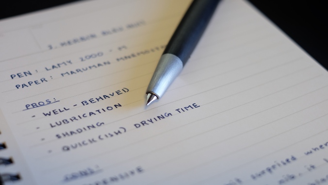
It has all the characteristics that one would expect of a J. Herbin ink. It’s lubricated, well-behaved and there is a decent amount of shading. This was especially accentuated through my use of a slightly wet medium Lamy nib. I’m sure the shading would be turned down if used in a fine or extra-fine, so that’s something to keep in mind if shading is something you look for. As I mentioned above, the color you see in the ink bottle and directly from the nib can confuse you, but be assured that it dries to a neutral blue-black. I honestly enjoyed watching it drying as it looks similar to how Shin-Kai looks when it has dried.

DSCF1641

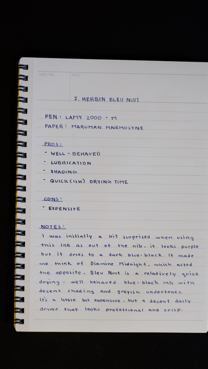
One thing that might be a bit of a drawback with this ink is, as always with J. Herbin, a little bit on the expensive side. The 10mL can be bought for $5.50 on JetPens (not sponsored) and the 30mL can be bought for $12.00 from all your favorite pen shops. On the other hand, Diamine Blue-Black, another great blue-black ink, is priced at $7.50 for 30mL. My advice would be to get the 10mL to test it out and decide if you like it before purchasing any larger sizes.

J. Herbin Bleu Pervenche

DSCF1586

I’ve had this ink for a long time and just got around to writing a review now. I saw that J. Herbin was selling tiny bottles of ink for very affordable prices and couldn’t resist getting some. When it comes to reviewing, one thing I have to worry about is the cost of the inks. I have to constantly decide whether a whole bottle of ink is worth it and if I’ll even be able to use all of it. I really like using the ink for at least a minimum of 2 weeks mainly for writing notes. With the amount of notes I write, an ink sample is not enough at all to experience and then review.  That’s mainly why the tiny bottles of J. Herbin were perfect to get a good amount of writing done and not break the bank.

That being said, it is a little inconvenient to fill up a pen with a bottle this tiny. The opening is barely enough for the Lamy 2000 and only smaller pens would be more easy to fill up. The TWSBI Eco was pretty easy to fill, but I’m predicting it won’t be as easy once the level of ink goes below a certain point. Then it will be an interesting experiment to find an efficient way to fill up my pens without creating a mess.

DSCF1592

One thing that really appealed to me right off the bat was the vibrancy of the color. When filled up inside a demonstrator pen like the Eco, the ink looks much darker and its a surprise when the nib touches the paper and a bright blue is all you see. I used this ink in multiple pens from the TWSBI Vac Mini, Lamy 2000 and the Pilot Custom 823 and it was well-behaved in all of them, as I’ve come to expect from J. Herbin inks in general. The ink is decently lubricated and flowed well out of all the pens I tested it in. When writing with some different nibs, I noticed that there was good shading from an EF to M nib and while it may not be apparent from the photo, the sheen on the ink is slightly red in places where it pools. It might be my eyes playing tricks, but I also see hints of green too. It’s a pretty looking ink that any lover of light blue inks would like.

DSCF1595

While Bleu Pervenche has all those great characteristics, it also has some drawbacks. The one I experienced the most frequently was feathering. This ink is very finicky on the type of paper you use it with and the only type that worked perfectly for me was Rhodia. Even the Maruman Mnemosyne notebooks which I absolutely love and are tanks when it comes to inks, showed signs of feathering when I wrote notes. This was most prevalent when I adjusted the amount of ink due to some skipping with the TWSBI. With that, the dry times I experienced were north of 15 seconds on Maruman paper, which became a huge hassle as I had to wait for the ink to dry before turning the page to continue taking notes. I had made the mistake of not waiting a couple of times in a rush and the back of the notebook got stained and the letters got obscured.

DSCF1596

Overall, Bleu Pervenche is a very well-behaved light blue ink that has decent lubrication and great shading. It works really well with Rhodia paper, but if you don’t mind some feathering, most other notebook brands like Maruman and Kokuyo will work fine. Depending on the nib you use, your dry time may differ, but I would recommend for those using M nibs and above be aware of the slightly longer dry times and compensate for them accordingly. Other than that, I recommend picking up a small bottle of J. Herbin’s Bleu Pervenche to try out.

Diamine Grape Review

DSCF0217

Purple is not a typical ink color I use due to it being a little out there. However, after a rather amazing experience with Iroshizuku Yama-Budo, I started to see how I could use purple as more of a color for personal stuff. I like to keep a bullet journal going, so I first started to use this ink as a specific color for tracking my tasks for the day. That was almost 2 months ago and I’m still using it to this day. In fact, the 30 mL bottle I had is almost finished and I’m contemplating getting more. I don’t know whether I want to make this a permanent member of the rotation given that Diamine and other brands all have offerings in a similar shade. Personally, by not making something permanent, I can go and get a variety of inks that I’ll be able to review and I might find some other ink that becomes a new favorite. I’m honestly a little stuck regarding this.

DSCF0225

However, you guys came here to learn about how this ink handles, so I’ll get back to the review. The ink is on the darker side of purple, which appeals to me a lot as I can see it being something that fits in with all the other inks I have. The shading is really nice but on the medium side due to how dark the ink already is. I found that you can’t see much difference between the second and third passes as it’s too dark to really tell. It can be exaggerated through the use of a folded pen, like I did in the first photo, but its limited. It’s pretty smooth flowing and the performance is up to Diamine standards, so it behaves well in every different pen I’ve tried it with.

One complaint I have with it is that it feels a little dry when in use. Don’t get me wrong, it flows smoothly, but the actual ink itself makes me feel more feedback when writing. I tried it out in the TWSBI ECO, Lamy 2000, Platinum Preppy and others, but the same feeling of dryness persisted. An example of an ink that doesn’t have this problem would be Iroshizuku Yama-Budo, it has a bit of a slick feeling to it, allowing a smoothed nib to glide across the page. With Grape, it lacks that same feeling, but at the price point that Diamine offers it at, it performs pretty well. If you’re looking for a dark purple with subtle shading at an affordable price, this is a great contender.


Diamine Red Dragon Review

DSCF0208

A review that I personally have been delaying for a while now. The main reason is that I just hadn’t been able to get a good chance to use it. The way I review inks is by inking up a daily use pen like my Pilot VP or my Lamy 2000. I use these pens specifically because I know how well they perform with my favorite inks like Diamine Asa Blue, Iroshizuku Shin-Kai and Kon-Peki. I have a solid grasp of how well they perform and by inking one of them up I can get the best grasp on how a particular ink performs. I use them for a week and a half minimum before I’m comfortable enough to voice my opinion on them. The biggest issue I had with this ink is the problem of incorporating it into my daily use.

DSCF0212

As anyone could probably tell by now, I love blue inks and all the shades they come in. One could even say I’m partial to the color blue. I’m not into red inks for the most part as I find no use for them when taking notes for my classes. My notes are done in different notebooks all with different shades of blue. The only other color I have used other than blue is black for the occasional diagram or note of importance. As one could imagine, suddenly transitioning from blue to red would be a little difficult. However, I chose to do so for my marketing class that I took for 6 weeks over summer. I started using Red Dragon halfway through the course and made sure to finish it by the time I was coming back home.

I can say with confidence that I am definitely happy with the experience. The ink shows consistent performance that one can expect out of a Diamine ink, but also be in such a tasteful color. The biggest gripe I have about colorful inks is that they always feel a bit too garish for my taste, I prefer subdued and subtle colors and that’s exactly what Red Dragon is. The shading is nice and visible at the points the nib is lifted off the paper. Its nice and smooth coming out of the nib, much like my favorite Asa Blue and to top it off, its available at the affordable prices that Diamine sets for their inks. I’m probably going to find some way to use this in my daily note taking for the upcoming Fall semester. If you’re looking for a very nice, subdued red ink that performs well, I cannot recommend Red Dragon enough. After I use up this 30mL bottle, I’m gonna go for the bigger 80mL, becuase that’s just how good this ink is.

Sailor Souten Review

So sorry for not being active for the last month almost. After Spring Break, the amount of work I had to finish went up drastically and there’s still lots more to come. I just finished my exam week and only have a month to prepare for finals. This weekend is a small respite, as I finally had time to sit down and finish a couple of reviews. This will be number 1 of 3, to make up for the end of February. The second and third will come tomorrow, officially finishing the quota for March. I don’t know if I’ll be able to put any out until after the semester’s over in May, but I’ll try my best to keep you guys updated. Please follow me on social media for quick updates. You can follow me through the buttons on the right for Twitter and Facebook, and my Instagram feed gallery is linked to my profile.

DSCF9034As you all may know after all this time. I love me some blue inks. Any shade, any brand. You name it, I’m willing to give it a try. I’ve had this ink for almost 2 years now. The ink is almost finished, so I knew I needed to get a review in before it ran out.

DSCF9037By the time I got onto the Sailor bandwagon, I found that some of the inks I really wanted to try had officially been discontinued. I could no longer find Grenade, Epinard and Sky Blue. I was immensely disappointed at not getting the chance to review them, but perked up when Sailor announced that they would be revealing a new Four Seasons ink line that would be the future of Sailor inks. Excited, I waited with bated breath for the Los Angeles International Pen Show to get my hands on some. When I reached, I went straight over to the Anderson Pens booth and got this bottle of Sailor Souten (Azure Sky), the touted successor of the Sky High. I have to say, I was not disappointed at all with my purchase.

DSCF9043The performance of Souten is about as expected of any Sailor ink. It behaves well in every pen I ink it up in and shades differently based on the nib size and any special characteristics. While I wrote the review with my Lamy Safari M, I usually used it with my TWSBI 580 Pendleton BLS grind fountain pen. The unique grind on the nib allowed for the shading to really show through.

DSCF9039The ink also has a beautiful red sheen when used in a broad or wide italic nib. The red is concentrated around where the ink typically pools inside the letters. However, if you’re using this ink with a fine or extra fine nib, don’t expect any real shading or sheen to show when writing.

DSCF9046Now for the Sailor performance, you’re going to be paying a rather premium price. This ink typically retails for around $18 at Anderson Pens and other similar retailers, I’ve seen it go for $14.25 on JetPens, which is by far the cheapest I could find it going for. If the price doesn’t bother you, then this is a solid, well-behaved blue that will perform well in any pen you use it in. I recommend this to anyone who likes Sailor inks and wants a nice blue to add to their collection.


Diamine Sherwood Green

DSCF7892

Sherwood Green has quickly become one of my favorite green inks and for good reason. Rich and saturated with a color tone resembling that of a dark forest. On thinner nibs, I noticed that there was a huge variety of shading. When I was testing it out in my Platinum Nice Pur fine, I noticed a chromatic effect when observing the tops of the line going from a light to progressively darker color at the bottom where the ink seemed to pool when the nib pulled off the paper. It has really helped me open up to the wide array of green inks I never thought I’d try. It allowed me to take a small step outside my comfort zone and traditional color palette of blacks and blues when it came to my inks. I can’t wait to try many more offerings from Diamine as well as the numerous other companies. If they’re anything like Sherwood Green, I know I’ll love them.


Diamine Asa Blue

Let’s kick off review week with a long pending ink review.

Originally not on my radar, as I was too obsessed with Noodler’s Liberty Elysium, Iroshizuku Kon-Peki and the many other blue inks out there. This one took a while to get my attention. I was initially introduced to it through a post by Ed Jelley (love his photography 🙂 ). The post was titled “5 Best Inks for Everyday Use”. Curious about his choices, I read through it, and the one that caught my eye was his photo of the shading of Diamine Asa Blue. It just called out to me through the screen, begging me to try it. Being the highly disciplined person I am with full control of my impulses, I immediately went and purchased a 30mL bottle and haven’t looked back since. I have gone through many a sample of blue inks, some I have loved, others not so much, but this… After I first used it, I felt like the search for my ideal blue ink was finally over.

While it may sound like hyperbole, I sincerely believe that I have finally found it. Diamine has been holding the hidden gem that I have been searching for all this time. If only a month ago, you had asked me what my favorite blue ink was, I would’ve unhesitatingly answered: “Iroshizuku Kon-Peki”, but now it would be “Diamine Asa Blue”. To me, Asa Blue is now the benchmark I will judge all the other blue inks I have yet to try. For me, Asa blue satisfies many requirements when it comes to color and performance, so I’ll be elucidating upon requirements shortly.

DSCF7029

From the moment the nib touched the paper, I knew that this would most likely replace Kon-Peki as my favorite blue. The color and shading resembled Kon-Peki so much, yet at the same time, just glancing at it, Asa Blue seems much less resplendent. Kon-Peki, especially on the bright white Rhodia and Maruman paper I use it on, just glows brightly. Asa Blue on the other hand, tends to be much more subtle, yet still nice and visible. I first used it in my history class, which I had on Fridays for 4 hours (glad that’s over). Typically, it was a lecture only class with the professor talking and the students noting down the most salient points. The long time period allowed for the most experimentation and writing down notes for hours together helped me see how well it performs during long writing sessions. I was pleasantly surprised by how well it handled being in constant use. Despite the shrinking amount, the smoothness wasn’t affected in any way, and it continued to perform admirably.

DSCF7030

The pen I first used Asa Blue in, was my Pilot VP Matte Black with the binderized M nib, which is still going strong. The Pilot VP is my everyday writing pen in school, it is the pen that has had the most use in my collection by far. Typically when testing inks, I like to load it up in the VP simply because the tuned nib ensures that it won’t be the nib’s fault if the ink doesn’t perform properly. After a 4 hour history lecture, when reviewing my notes before the quiz, I saw how wonderful each letter looked on the page. The color of the ink was exquisite, to say the least. It was then I knew that I had found my everyday blue ink.

DSCF7031

The shading is one of the major things that drew me towards this ink. I love blues that get darker with bigger nibs, it allows for more experimentation and manipulation when writing. Asa Blue shades very well as seen in the picture above, and past a certain point, I got the hint of a red sheen.

DSCF7032

Overall Asa Blue has been one of the best Diamine inks I have ever tried. The color and shading make for an excellent everyday blue that can walk the fine line between fun and whimsical, to serious and professional. It performed very well on the variety of papers I used to test it with little variation. After only a month, I polished off a 30mL bottle which in itself shows me how much I love this ink. All I can say is, if you love blue inks, you have to give this a try. Well, it’s time for me to go purchase some more and hope Diamine offers it in sizes larger than 80mL :P. Look forward to tomorrow’s review, and as always, write on, my friends.

Noodler’s Bad Blue Heron

DSCF5997\

I was really in desperate need of a subtle blue-black ink when I purchased this bottle. I had nothing but vibrant inks, and I wanted something more professional looking. Enter Noodler’s Bad Blue Heron. It was by sheer coincidence that I managed to try this ink out. I was at the L.A. Pen Show, and I was learning about the history of Spencerian script from the master penman Michael Sull himself. I was seated next to a gentleman who was using a Matte Black Pilot VP to take short notes. Coincidentally I was using the same pen, but with a different ink. We left the pens to close together and I accidentally picked his up and started to jot down something. It was at that moment that I felt how amazing this ink was. It made the nib of the VP glide over the DotPad I was using. I was surprised and quickly apologized for the mistake. Almost immediately after seeking forgiveness, I asked him about the ink he was using. He told me that is was his personal favorite and that he uses it in his pens with bigger nibs to accentuate the shading. I proceeded to go down to the Anderson Pens table and immediately secure myself a bottle.

The ink was slowly incorporated into my pen rotation, and I’ve never looked back. Over the months of use I have not experienced any degradation in writing experience and I always look forward to inking one of my pens up with it. No matter which pen I’ve used it in, the flow was smooth and consistent, it helped the nib glide over the page, laid down saturated characters and turned out to be bulletproof as well. All in all, this is one of my favorite go-to inks for any official correspondence as well as filling out forms. It looks great on a white paper, and the color is subdued and easy on the eyes.

Noodler’s Liberty’s Elysium Review

Happy Memorial Day!

Today, we give thanks to all the brave men and women who have laid down their lives to ensure that we can live ours in peace. I also want to thank those who have served or are currently serving in the armed forces. Thank you so much for your selflessness, and sacrifice. In honor of this great day, I give you this quote:

DSCF3114

Every time I hear the word “liberty”, the first thing that pops into my head is this timeless quote by Patrick Henry. Said in a time of oppression, and unrest. Great men came together to make this country what it is today, an independent nation.

On to the review:

DSCF3106

This ink is definitely a potential replacement for the bottle of Kon-Peki I have been using for nearly 6 months. It is vibrant, and lively while not being over the top like some of the brighter blues I’ve seen. It’s smooth in any pen I use, and any paper I write on. Combined with the saturated color, and shading, this ink is a versatile in it’s application.

Here’s a nib test as well as a look at the shading:

DSCF3108

DSCF3109

DSCF3110

Hands down one of the best, and most affordable blue ink I have had the pleasure of using, this will definitely be finished quickly.

I’d love to hear your opinions in the comments below. Thank you, and as always, write on, my friends. 🙂

Noodler’s Apache Sunset Review

DSCF2171

Very meaningful and direct, right? That’s what I love about Abraham Lincoln’s quotes. So I thought I’d share my favorite one with you guys. At this point in my life where I’m going to college, trying to find something I’m super passionate about, this quote helps me not stress out as much. It gives me a feeling of peace, where I just think to myself “Whatever will be, will be; I should live in the moment instead of worrying about what could be.” It helps me focus on what’s happening right now, and I hope reading it in my (sub-par) Textualis Quadrata calligraphy will have a similar effect on you.

Continue reading